DX Lab Fellows Diary
Post by Elisa Lee and Adam Hinshaw
Prototype, Milestone Presentation and Technical Strategies
We now have a prototype created from the web logs and the results are fascinating. It’s extremely easy to be distracted by the content people are accessing and hypothesise on their motivations for looking at it. This was a large part of the project’s intent so that’s a good thing. We’ve looked at 2 batches of data, both covering 3 consecutive days of catalogue views.
Here are some highlights:
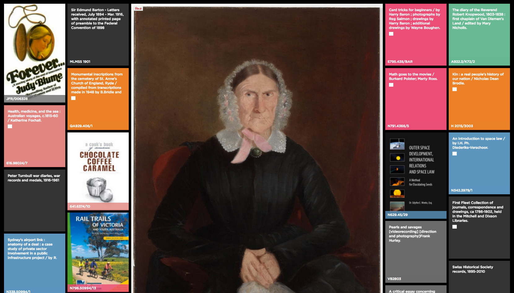
Sarah Cobcroft (1772-1857), free settler to NSW, looking disapprovingly at Judy Blume’s “Forever”, a sometimes controversial novel which looks at teenage sexuality. On conceptualising this project, we had anticipated that placing such diverse objects together these accidental narratives could occur. We’re amused by this one.
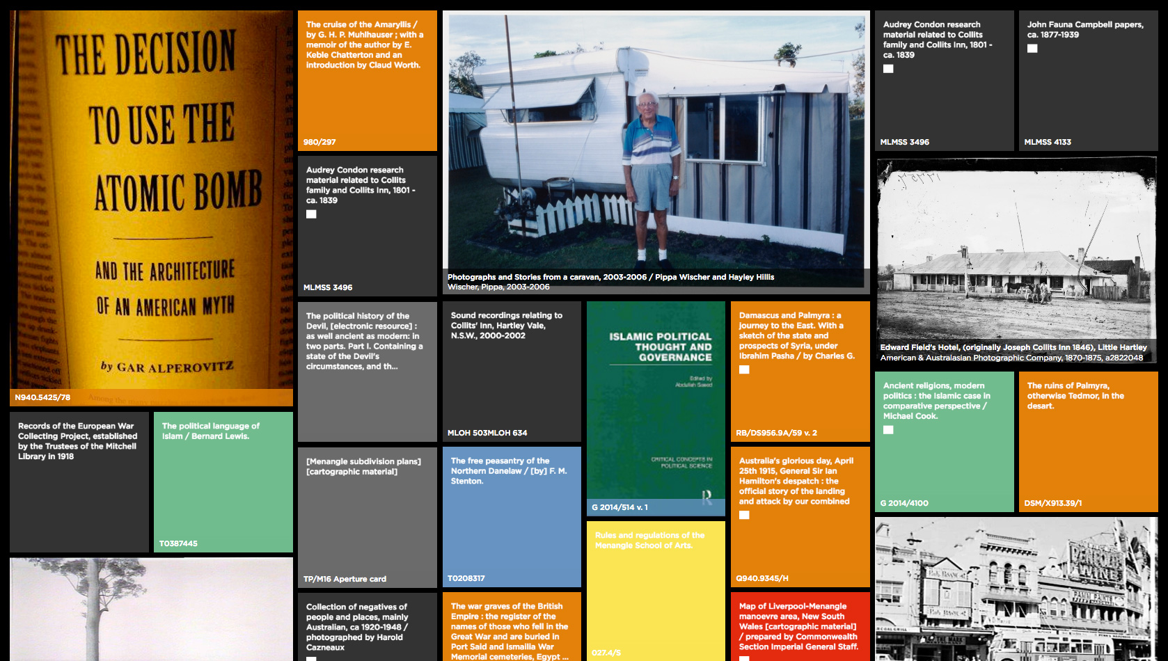
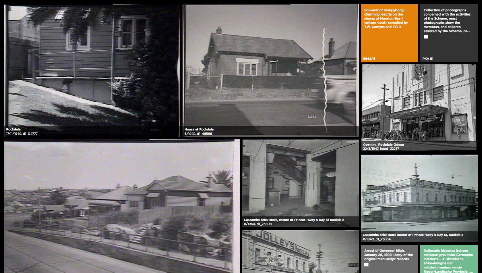
Creating the prototype has allowed us to see the flow and rhythms of real time activity and to finesse the display side, determining what metadata is interesting and useful to show along with considerations of layout, animation, typography, iconography and colour codification.
We’ve added functionality that allows us to tweak variables of the visualisation, e.g, change the speed, jump to a point in the time and toggle element visibility. These simple tools give us the ability to quickly interrogate the data, finding patterns and peculiarities and a means to resolve the appearance to an optimal state. The ratios between non-published and published views and how many items have images associated with them have been revealing.
Non-published content has the richest image assets and people tend to select items from searches that have an image attached to them. Published works so far bring up around 20% with cover images which are sourced from a 3rd party API. How then, to deal with items with no digital assets?
For both published and non-published we have utilised typography, iconography and colour. We were considering algorithmically generating book covers with abstract and figurative images but were uncomfortable about overlaying a visual narrative which did not necessarily relate to the contents or the intention of the creator. The current design is a modern version of the catalogue card with iconography indicating the format of the item in all cases except when it’s a book (most people associate libraries with books so let’s just highlight the exceptions). The simplicity of the design provides a visual break from the busyness of surrounding images and the colours provide an excellent contrast to the numerous black and white photos in the collection.
Use of colour for items without image assets: For non-published we use a standard dark grey colour, however for published material we have utilised Chris Gaul’s work on colour coding the Dewey Decimal System completed during his time as UTS Library Artist-in-Residence. See his library work here. It made sense to utilise his system as it is not only beautiful but aids in communication. Perhaps one day it may even become a standard.
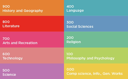
Chris Gaul’s colour codification of the Dewey Decimal System (with one alteration to the yellow).
Visualisations
The idea is to strike a comfortable balance between visual impact and communication. Sufficient detail must be provided to allow viewers to explore items of interest, but not so much that the greater visualisation becomes noisy and unreadable. The visual assets often speak for themselves and for those without imagery we inform via text, colour and icons. Non-published images are displayed in a larger size to book covers as they are just so compelling. Currently icons are placeholders and work is being done to design a suite to represent each format (maps, microfiche, photographs, online resources, drawings etc).
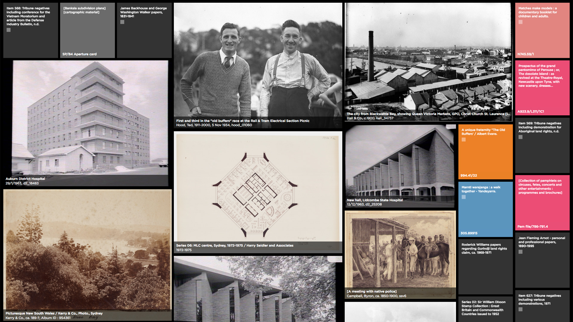
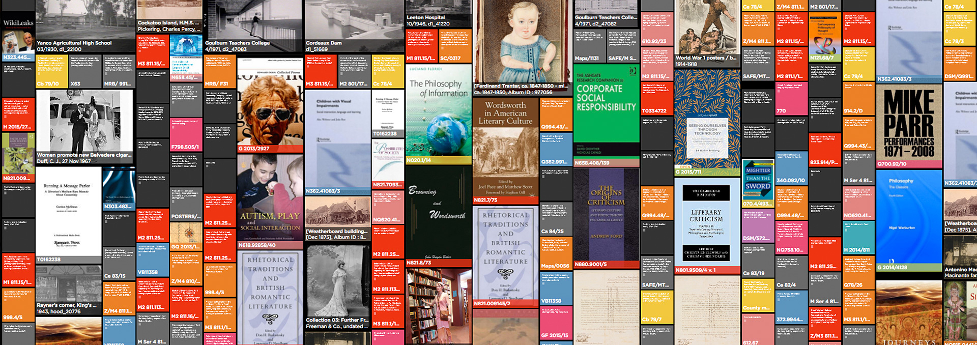
Snapshot of the visualisation
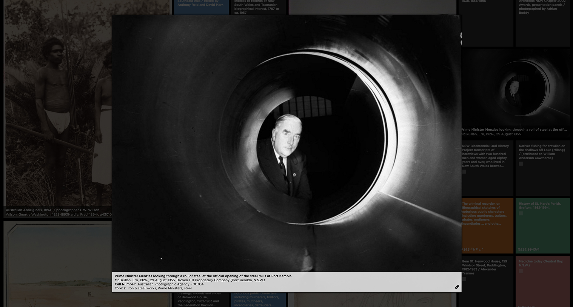
Detailed view of a non-published item with image asset
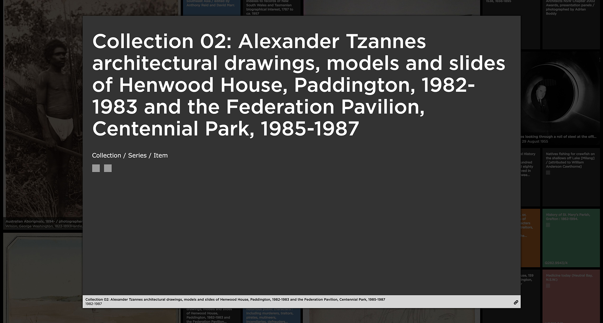
Detailed view of a non-published item without an image asset. The item will either be from a collection or series, or be an item. The squares are placeholders for Type of Format icons.
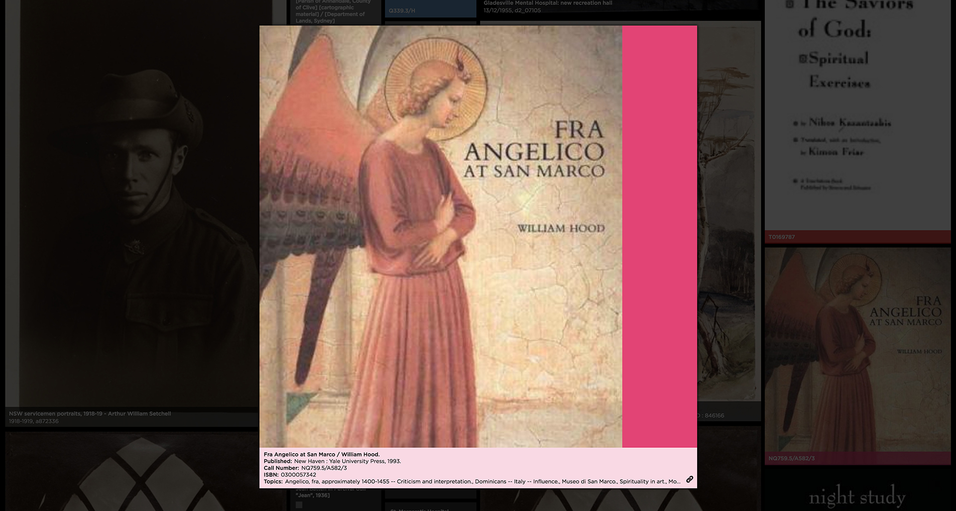
Detailed view of a published item with image asset
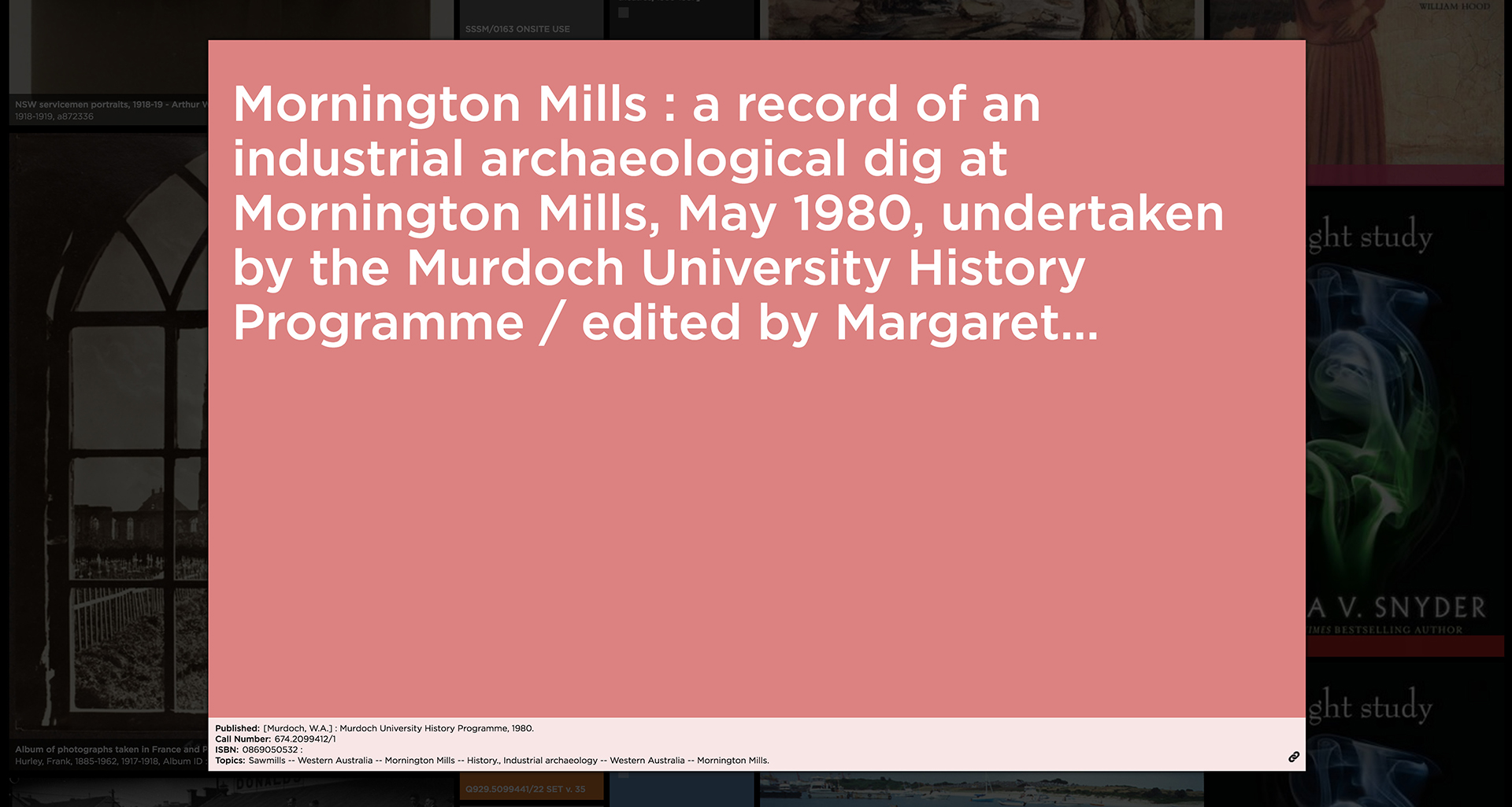
Detailed view of a published item without image asset

A bird’s eye view of 3 days worth of data (1-3 January)
Milestone meeting:
Work done to date has been presented to the library with positive feedback and a link to view the prototype supplied so that staff can reflect on it in their own time and get back to us with any comments or suggestions. Some reactions from library staff: “I had no idea that was in the collection” “I was the one who searched for those images!”
Next Steps:
As the library is in the stages of finalising its migration to the new systems we are able to start defining, in conjunction with technical staff, how we will obtain the realtime data stream for the final visualisation. We are also investigating tangible objects with the view to augment them digitally and have been searching the library’s hidden corners for the right object with thanks to our fantastic staff guides who are able to navigate this labyrinth. So far we’ve found some great drawers and microfiche readers which look promising.
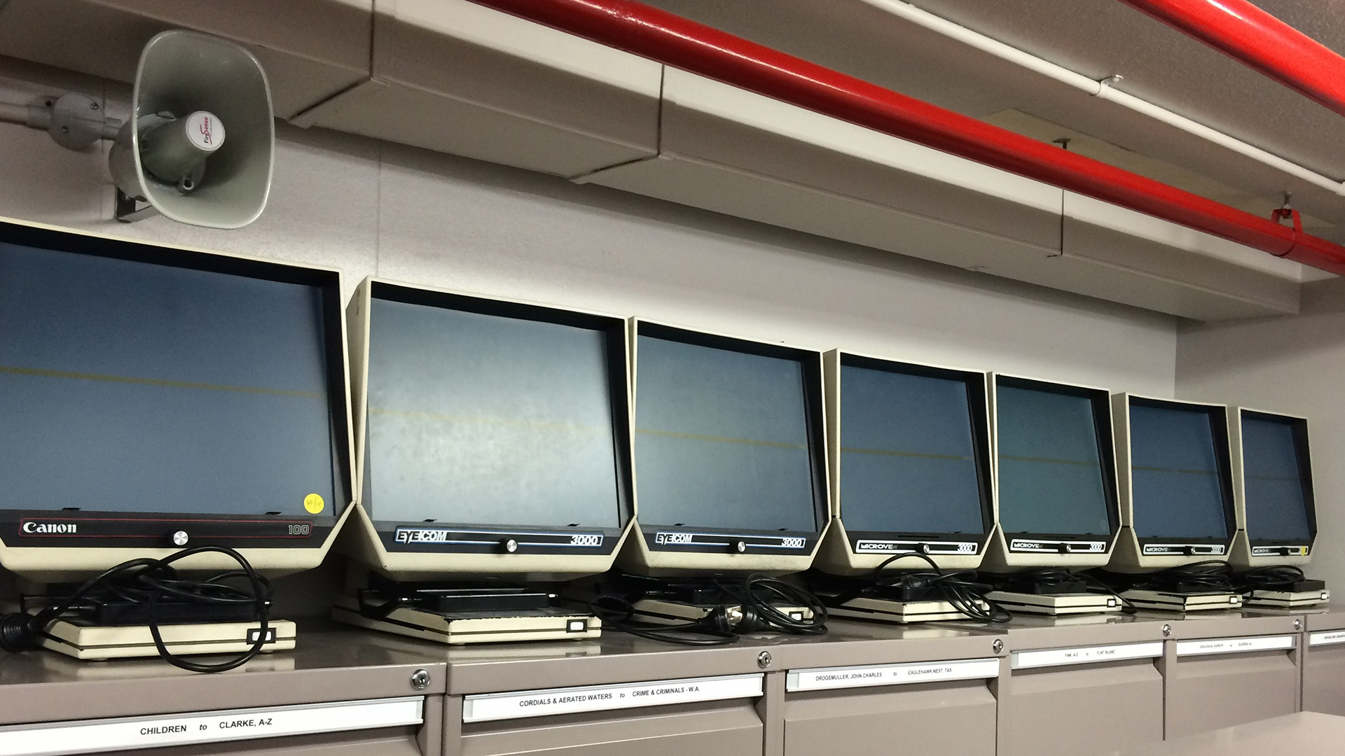
A bank of decommissioned microfiche readers


Comments
Hi Charles, there is a new blog post here on the making of the interface that also links back to the other diary entries.
What is the project about ? there is no explanation as to what you are doing and why.