Loom: index
Post by Paula Bray, DX Lab Leader, James Boyce, Creative Director Grumpy Sailor Creative and Mauricio Massaia Senior Developer Grumpy Sailor Creative.
Today we are very excited to launch the third and final phase of Loom, which we have called Index. (The third icon at the top of the interface)

Loom is the DX Lab’s first iterative experiment with data visualisation. The data it uses is from the Library’s collection and focuses on locations around the CBD of Sydney. Each view in Loom has focused on looking at the Library’s data through a different lens. With Index, we are looking at metadata in the form of subject headings as opposed to the first phase of Loom which concentrated on the images. In this phase, we used 14,664 subject headings from the catalogue records for the collection items.
To set some context, we had some initial aims for the whole project which have helped to guide us, they include:
- To showcase the Library’s collection in a new and engaging way
- To explore ways for users to meander through the collection when they don’t specifically know what they are looking for To showcase the Library’s collection in a new and engaging way
- To highlight how data can be connected in a visually beautiful but also in a meaningful way for the user
- To use our API, we needed to build with this to help us and learn about its quirks and work to inform others of our learnings
- To promote the DX Lab values and design principles
- Is the ‘thing about the thing’, it can leave room for others to improve and build upon (doesn’t necessarily have to be complete or finished)
- Be openly licensed for re-use.
- To share the process of the making of this visualisation and our learnings.
While this year-long project revealed many interesting things to us, the question of “what does it mean to remove the ‘search’ function from a collection experience?” kept coming up. The other challenge that we wanted to explore was, “is it possible to entice users to serendipitously find collection items of interest to them? “
To test both these theories and to keep the data set manageable we limited the size of the data to a pre-defined number of records relating to selected areas around the CBD.
We held a number of workshops with curators and developers to explore ideas about how to visualise and make this data available in new ways. The outcome of these conversations was, that to maximise the impact of this content, we should look at the same data in three different ways. These views, or lenses, are called Loose Leaf, Atlas and Index and each one explores a different aspect of the data.

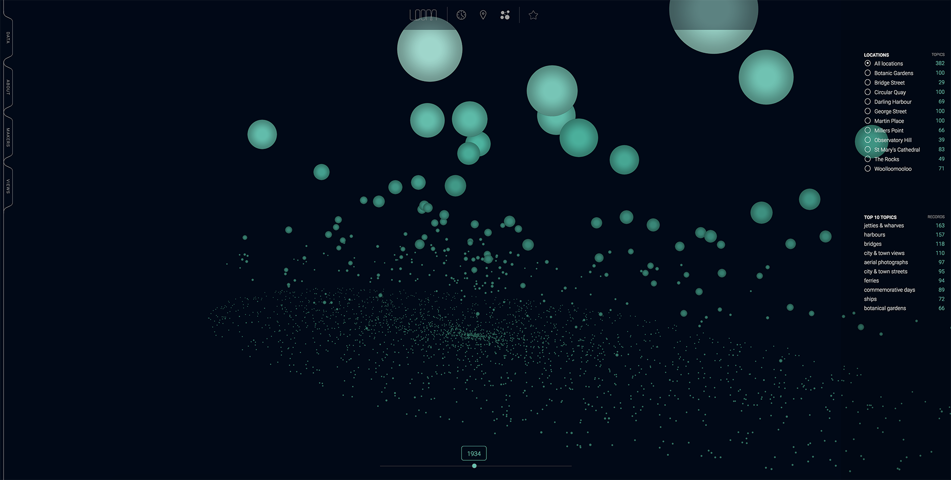
Topics catalogued with each item are represented here in an animated timeline.

This is the number of Topics for 1902 for all 3,287 images that are available in the first phase of Loom.
PB: Index was probably the most challenging phase of Loom to design and build, wouldn’t you say? Was this due to the large amounts of data to visualise in webGL that is essentially just words?
JB: The main objective of this final phase of Loom was to give a bird’s eye view of the extensive number of topics that lie deep within the ACMS database. The design challenge was how to display every topic in a way that allows a user to freely explore. It was important that any user could find interesting story threads as they move through time and topics. The technical challenge was born straight from the design and data decisions we had made early in the project, processing over 2400 data points within the browser is not an easy thing for webGL webpage to handle.
PB: We tasked you with bringing in an additional third-party data set for this phase, what challenges did this bring up and why was Trove the most relevant solution?
JB: Drawing correlations with an external data source, was a way of strengthening the story behind some of the spikes in the data. Being able to look at a topic in a certain time period, and then draw in external data to help support it, really gave us a way to contextualise the data that the user was viewing and made for some very interesting findings. We were intent on not connecting the dots for the user, we simply wanted to make it possible for them to do so themselves.
Trove was perfect for this. A huge Australian online resource linking books, images, historic newspapers to the time and place within Loom. We love Trove. Long live Trove!

The Trove API is being used to provide context for each topic and to give the user an option for deeper research into each one.
PB: What were some of the technical challenges working in WebGL for this phase?
MM: With Index we are displaying 3287 topic particles, which with WebGL it is fine to render, that is if they are not animated (static) and not interactive. So our challenge was to implement transition animations for each particle when changing between years and also making these particles clickable. After a couple of prototypes focused on process optimisation for animations and interaction we achieved a good result. The whole thing was a challenge but this was probably the biggest one.

Each topic can be clicked open to reveal more information, including the images, for each one.
PB: Have we been successful in allowing users to find, explore and research collection items without a ‘search’ function? Does Loom give ‘context’ to the collection items that is possibly not available in the collection systems?
JB: I guess that is really for the user to decide. Loom definitely provides a series of new lenses for exploring the digitised archives of the library. Through the various visualisations we have created, the user is prompted to dig deeper and understand the context of the visualisation and what lies beneath. We have really tried hard to reward the sense of curiosity and serendipity that the user brings to the equation. It’s something we have all experienced wandering through a collection, any collection, but is lost in online environments. What we have created is much like a pinball machine, with the user being the pinball, prompted at each juncture to bounce around the collection in whichever way they so desire. We can’t wait to see what the user reaction is to this third phase. It has been such a pleasure working with the DX lab on this flagship project, even if at times we all felt like pinballs bouncing around in unknown territory. That’s the point though right? To challenge to be challenged. As users we love exploring Loom, its data presented in a truly beautiful way, though that is a very anecdotal and subjective assessment it does make big projects like this all the more satisfying when you truly love how they turn out.
We hope you enjoy this final phase of Loom.