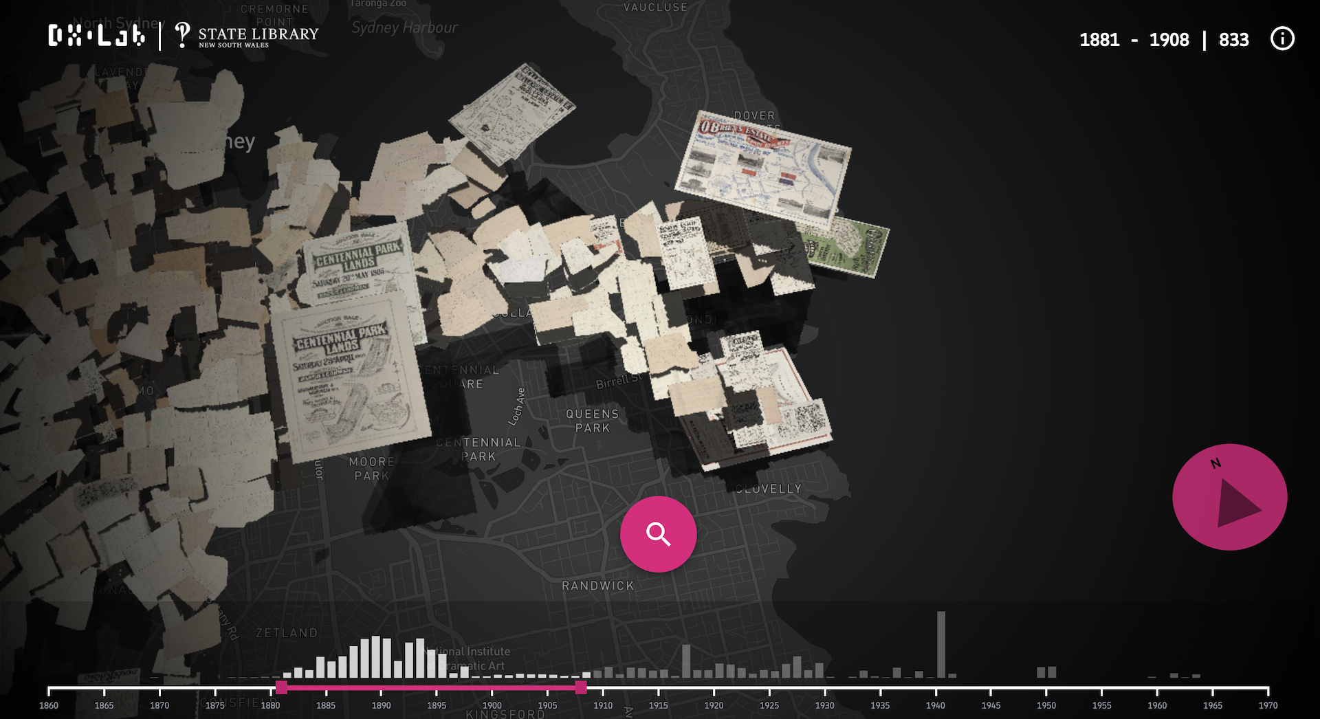
Making Sub Plot
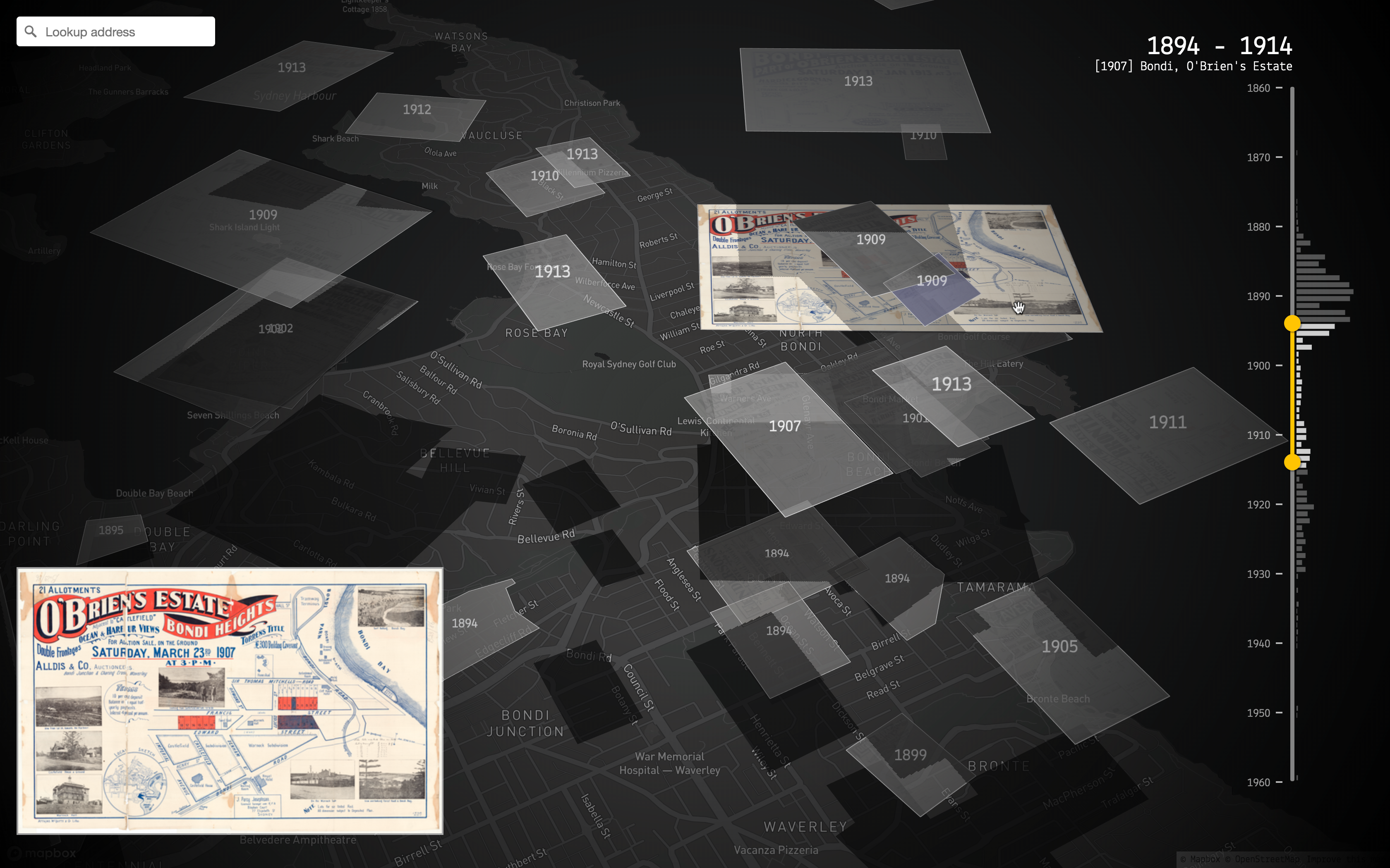
Sub Plot, the latest DX Lab experiment, uses a significant collection of inner Sydney Metropolitan detail surveys, Block plans and subdivision plans.
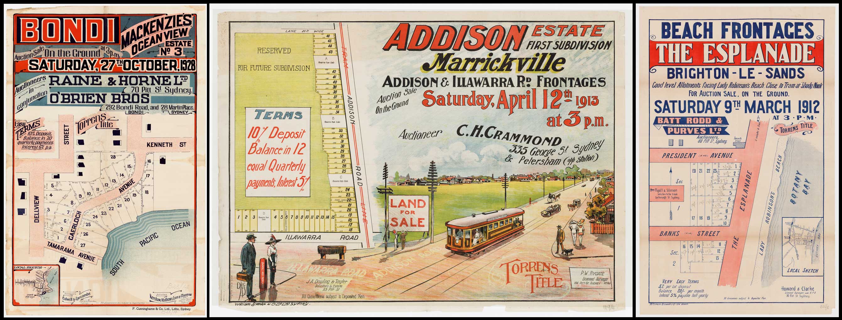
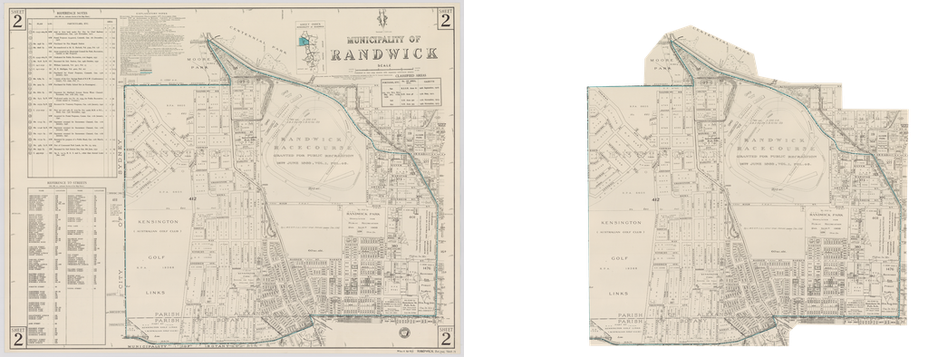
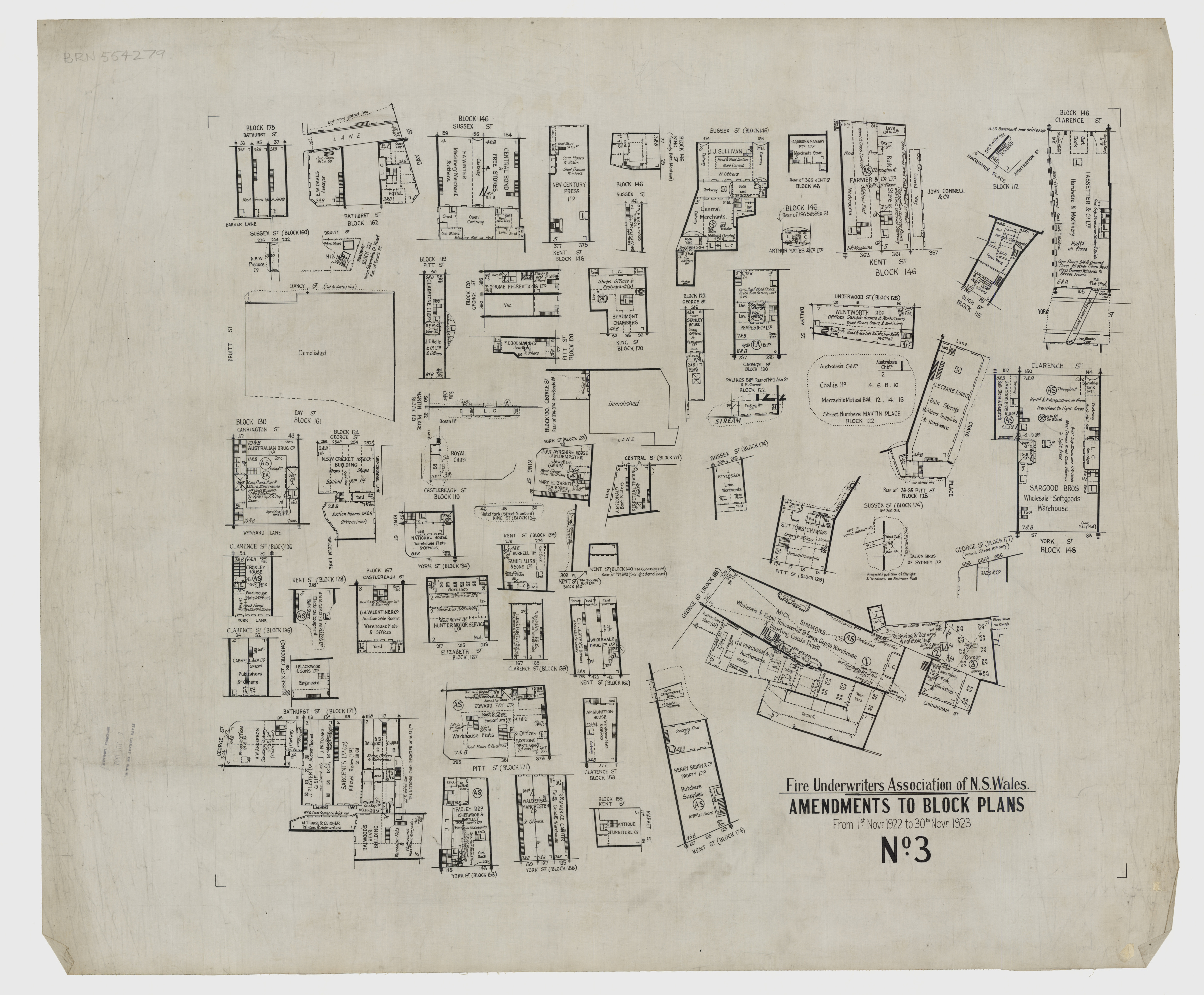
The survey plans of inner Sydney suburbs and central Sydney were produced by the Surveyor-General’s Office, for the Department of Lands in Sydney, between 1883 and 1920. The Block plans were produced by the Fire and Accident Underwriters Association of New South Wales between 1919 and 1940. A selection of real estate subdivision plans printed between the 1860s and 1930s have also been included.These auction and sales plans were produced by real estate agents and developers to publicise land for sale and often provide fascinating information on sale prices and local amenities such as trams, parks and waterways.– Maggie Patton, Manager Research & Discovery
PB — This data set was originally located in Klokan. What did you have to do to this data set to make it more structured, in order to use it?
CA — Initially the data provided was a CSV dump of the GeoReference data exported from Klokan, however the data only contained some basic information of the geo-referenced images such as title, thumbnails, longitude and latitude boundaries. Since we were interested in the portions of the image that was geo-referenced, I crawled the web interface Klokan used to run the crowdsourcing project, and extracted other available information. Crawling the website gave us new data such as the list of GeoPoints the user used to geo-reference the image, the cut lines in pixels of the areas where the maps were located within the image, and the most important piece of information: the World file for each image. This file will allow us to convert the cut lines from pixels into GeoJSON polygons.
Once the data was ingested and loaded into a temporal MongoDB database, I started the process of extracting useful data from the image title such as suburb name and year. Subsequently, cleaning and normalising the data and cross referencing it against data exported from the State Library online collection.
Using the World file for each image mentioned before, I converted the cut lines into GeoJSON polygons. In this part of the process it was necessary to check if the polygons were valid and if they didn’t have ‘Linear Ring’ loop crossings. In the cases where there were loop crossings, the polygon was fixed using a python library called Shapely.
Now that the data was clean, it was time to process the images and to generate web-friendly cropped versions using the State Library’s high resolution ‘co-master’ images, including only the content inside of the cut line. Also for each image a perceptual hash was created to enable ‘more like this’ functionality where related images were linked based on similarity using the Hamming distance and geolocation proximity.
The end result of the data processing was formatted into a GeoJSON Feature collection and then saved as a JSON file that we could use in the browser, thus avoiding creating a server-side backend. The final JSON file can be found here.
PB — What technologies have you used to make this experience and why did you focus the experience around the Sydney area?
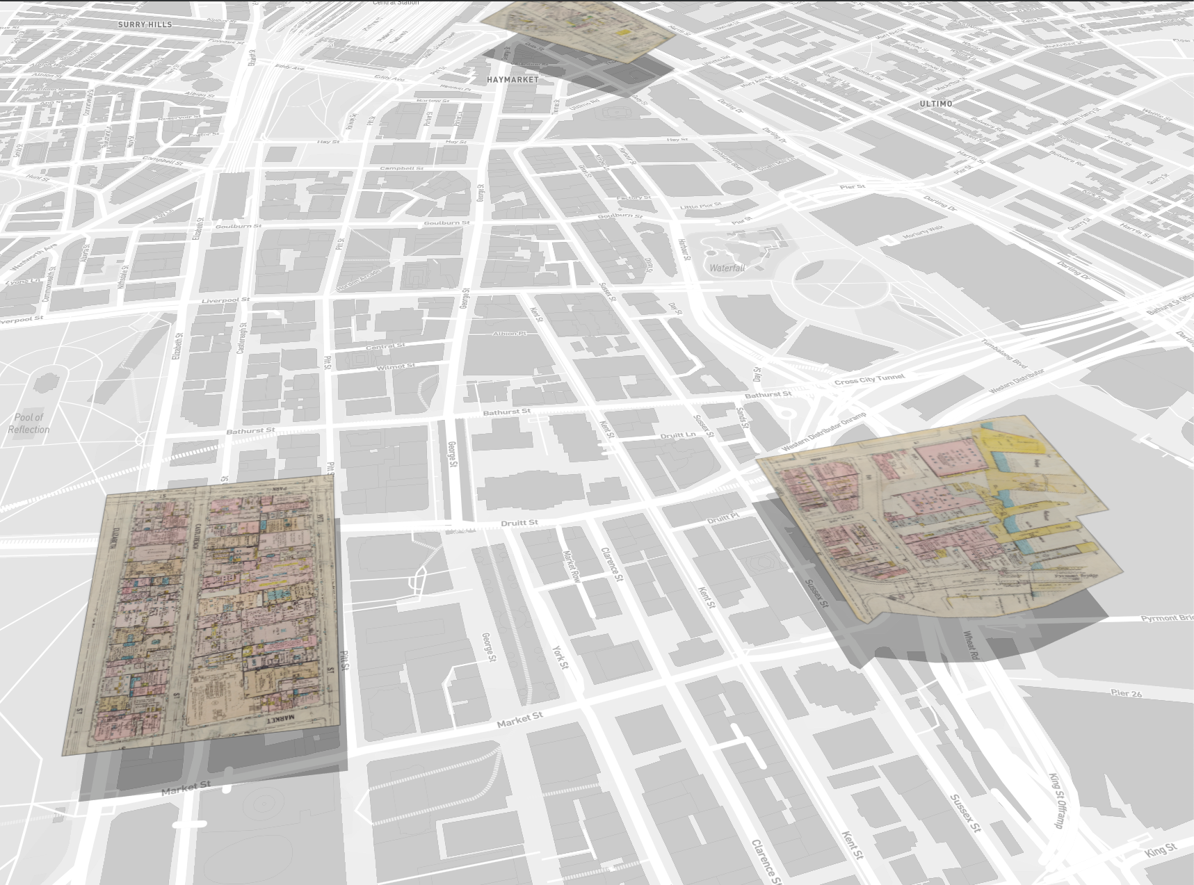
CA — The decision of which technologies to use was informed by the requirements of the visual concept we wanted to achieve. We wanted to stack maps on top of each other, similar to the way old maps were updated where, instead of re-doing the whole map, the update was done on a separate piece of paper and then carefully placed on top of the section of the map that needed to be updated.
We required the capacity to do the following:
- place multiple maps on top a modern map
- display the image in 3D or 3D-like map
- allow adding of custom layers of data
- WebGL rendering so we could offset some of the data visualisation to the GPU.
After some research, I decided to use DeckGL, a WebGL-powered data-visualisation framework in combination with MapboxJS for rendering modern vector maps, since it allowed what I was looking for, displaying stacked maps in 3D-like projections on top of real maps.
The application is built around a custom DeckGL layer. This layer allows reading various sprite textures containing tiles of maps. Also this layer encodes in the GPU various attributes like opacity, elevation and visibility that takes advantage of DeckGL GPU optimisation and transitions without the need to use CPU process for filtering visible maps.
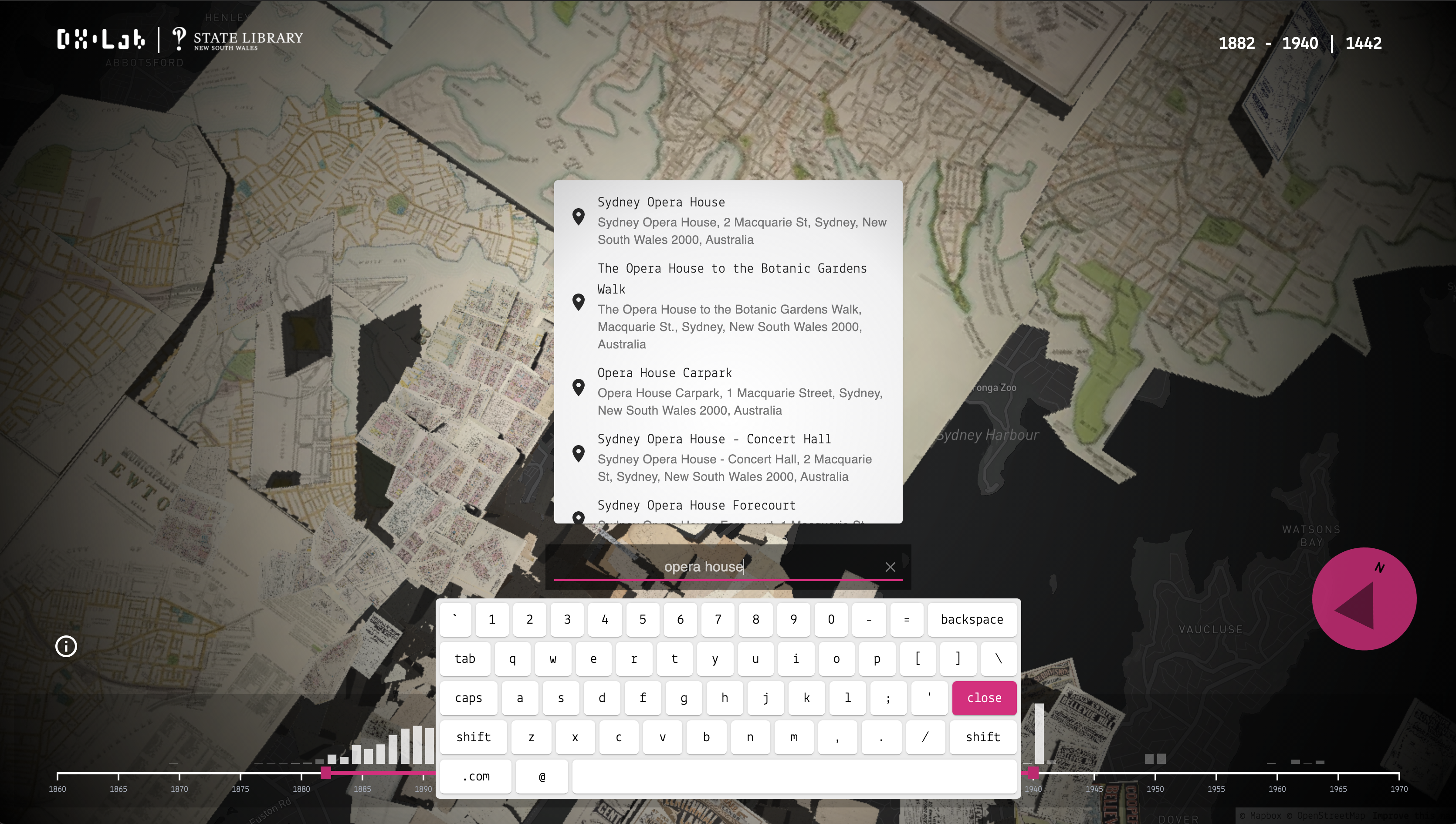
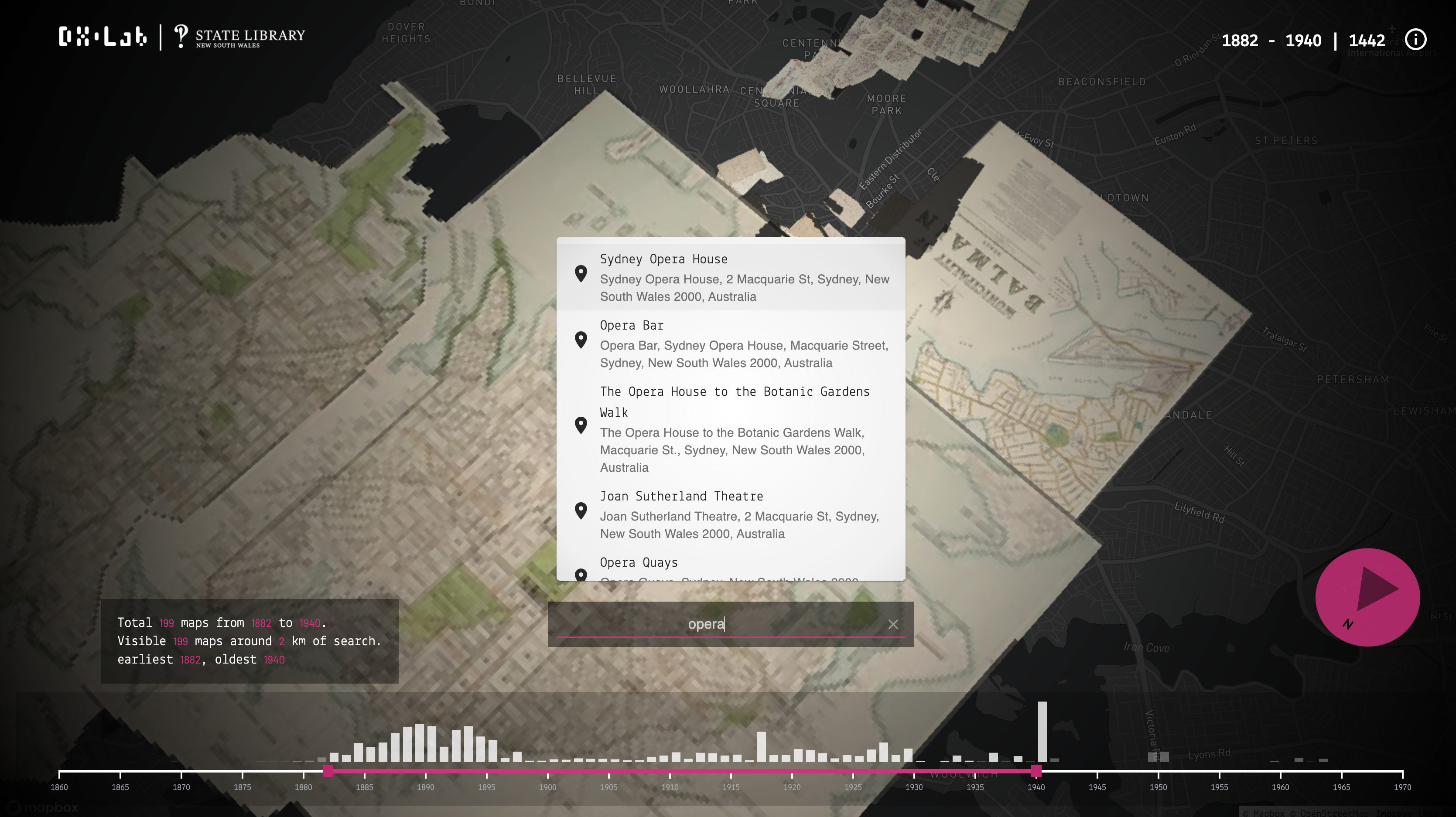
When a user searches for an address we use a Mapbox service to find the latitude and longitude of the search term, and then within the browser we use JavaScript spatial libraries to find maps for that particular location, eliminating the need to have server-side backend just to support this functionality.
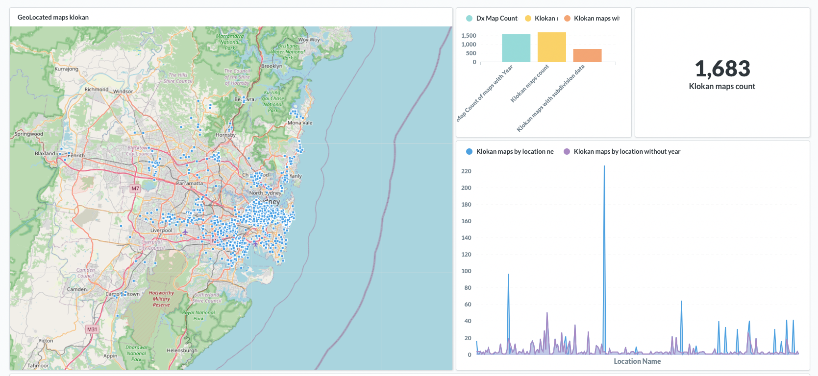
The decision to focus on the Sydney area was based on the data exploration I did after the data was processed. I plotted the centroids of each image boundary and it was obvious that the majority of the maps were located around Sydney. I also took into consideration the amount of data that was most complete in the dataset.
Initially we started with 1,683 maps and after the clean up and data validation processing we ended up with 1,531 valid maps.
PB — You had some challenges with this project, what were they and how did you resolve them?
CA — I had two main issues; one was performance and the other was more a requirement. We wanted to avoid deploying a backend just for this experience as much as possible, given the dataset does not change often (if at all). We needed to be able to perform basic filtering and geo-lookups in the client side.
Performance
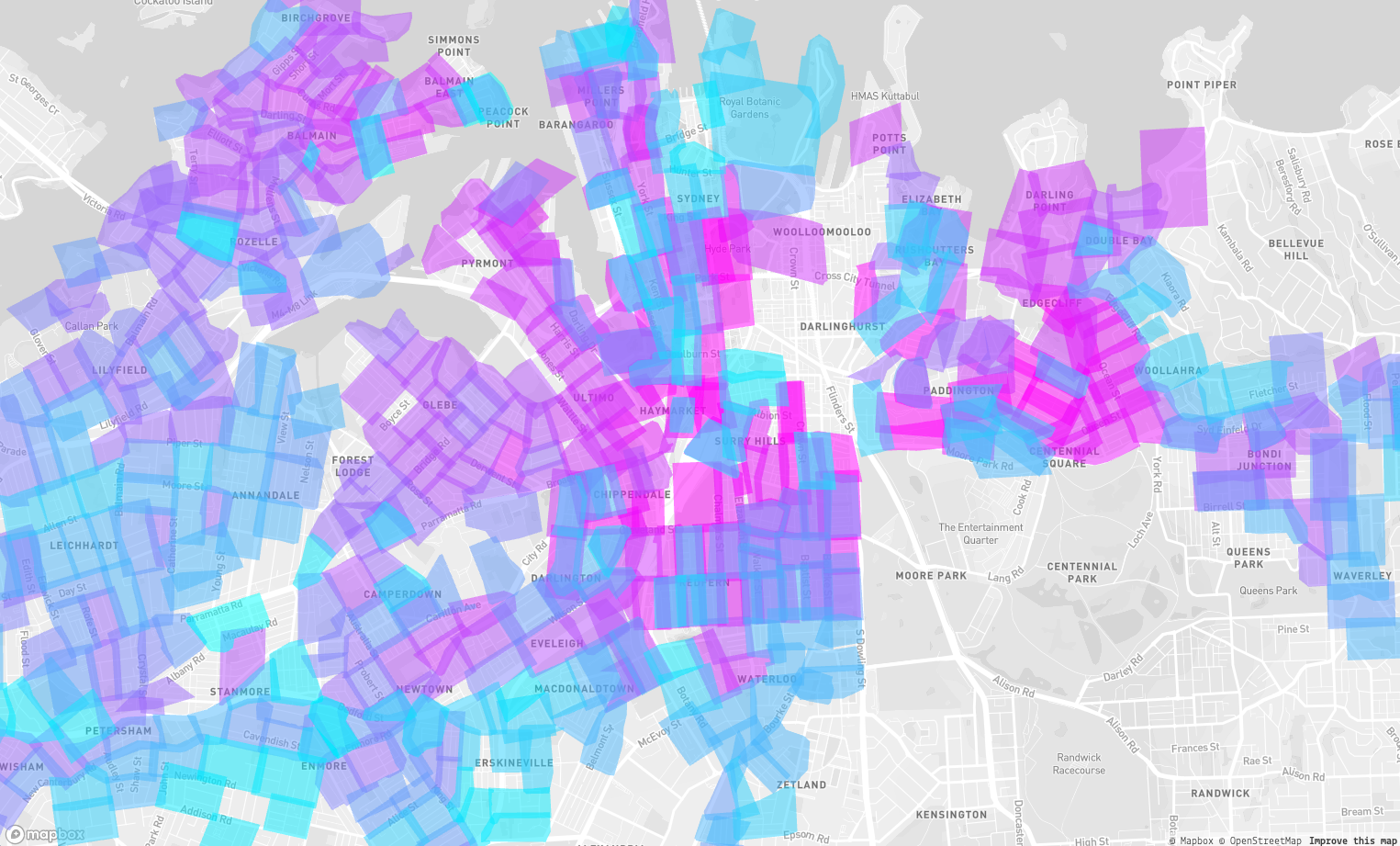
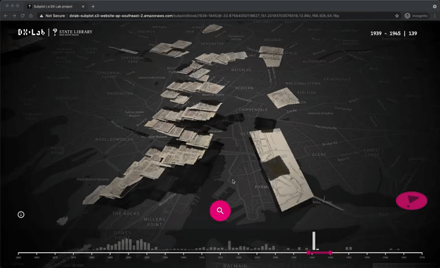
At the beginning the naive approach was to create an individual bitmap layer for each map. Meaning that we were loading 1,531 images in individual layers and sometimes even more layers if I included GeoPolygon versions of the map as shown below in an earlier version of the app. The performance of DeckGL decreased because of the amount of layers in use, as described in the developer guide of DeckGL.
For that reason we needed to lower the number of layers and also find an efficient way to load all the 1,531 images without making 1,531 requests. To resolve this issue I created a custom deckGL layer that loads sprite sheets of maps, and added WebGL attributes for controlling elevation, opacity and visibility of each map. These custom attributes also gave us the opportunity to take advantage of DeckGL’s Attribute Array Interpolation so we could create basic animated transitions and filter the visible maps in the GPU.
Search lookups
To avoid implementing a backend to just perform basic geospatial queries for this small dataset, the solution was to use a combination of the libraries Turf.js and RBush to create a basic Geolookup engine. The general idea was to create an index of simplified polygon bounds using Turf.js and keep it in memory. Then when the user performs a search we use RBush search to find intersecting image bounds within the radius, latitude and longitude. This simple implementation gave us the features we wanted for the app without the need of a server-side implementation.
PB — You have built this for the browser but we are aiming to have this experience in our Maps Room onsite. Did you have to change much to make it into a touch experience?
CA — The core of the application is the same code base. However for rendering the custom layer some customisation were needed:
- The user interface (UI) in the kiosks provides a virtual keyboard and some components are placed at the bottom of the screen so they can be easily accessible to the users using the big touch screens located in the new map room.
- The custom layer uses a different set of large map sprites that use the maximum available WebGL texture units and texture sizes supported by the computer that powers the kiosk.
You can research the Subdivision plans in the catalogue. There is more information about our map collections through our Maps collection guide and the subdivision plans here. You can also order digital copies of these maps and plans from the State Library’s collection online. Sub Plot can be experienced in the Library’s new Maps room.