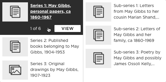
New collection hierarchies
Over the past year and a half, the Library has been hard at work building a new collection platform. You can experiment with the beta version here at collection.sl.nsw.gov.au. With over 3 million records and 4 million digital files ingested so far, this has been a huge digital undertaking, with many teams throughout the Library contributing to the project.
When we started thinking about a new collection website, a difficult problem arose almost immediately — how to design and build an effective hierarchy interface? In other words, how to make it as easy as possible for people to find items that were related to other items. This has been a long-standing pain point for Library users, due to the size and range of data in our collection. The DX Lab was asked to help solve this problem, essentially creating new interface to navigate the Library’s complex relational records.
What is a hierarchy?
At a broad level, the Library’s collection can be divided into two categories — published and unpublished. Published materials include books, journals, newspapers and music. These are generally flat records, so they do not directly relate to one another, however they may be connected by author or subject.
Unpublished records include manuscripts, objects and pictures. Also known as archival records, these are often organised in a hierarchical way, where one root record can contain other child records. These children can also contain their own children, much like a family tree or perhaps files and folders on a computer.
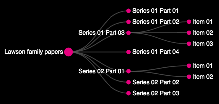
The Lawson Family Papers are an example of a fairly simple archival record. The following tree chart is quite compact and shallow, where most child records of the root do not have their own children, except for a couple of records (Series 01 Part 03 and Series 02 Part 01):
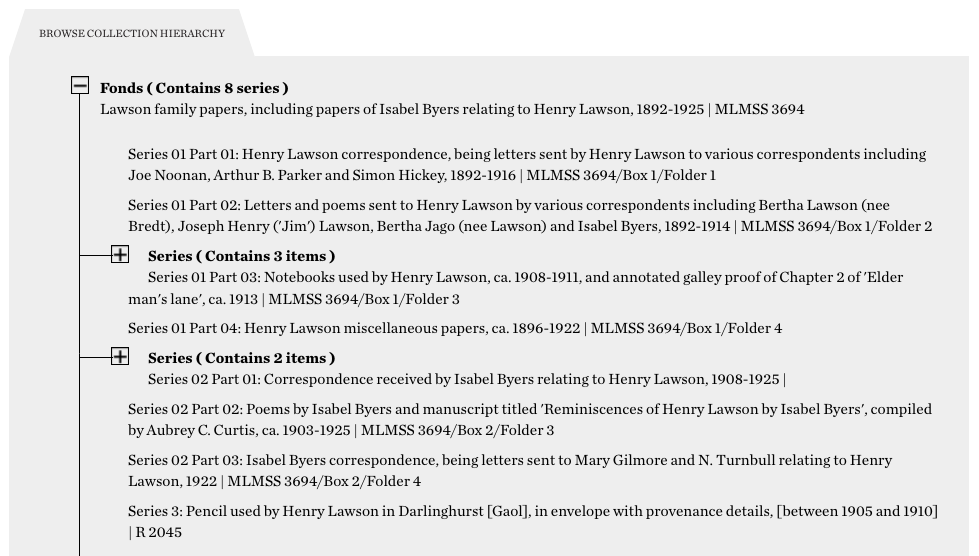
Here is the hierarchy tree interface in the current archival record page:
Tree limitations
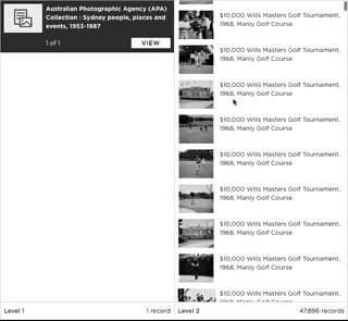
The hierarchical tree view works well for smaller hierarchies and is common in many collection applications. However it becomes quite unwieldy for larger hierarchies. The Library is home to several mega-hierarchies, with the largest being the Australian Photographic Agency collection. With a whopping 42k records under one root record, it is also the longest hierarchy in the collection. Here is a small part of the hierarchy:
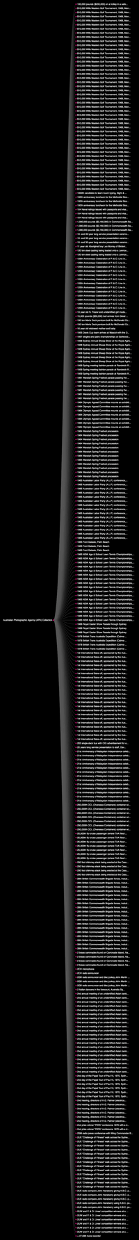
Did you get sick of scrolling? we are only showing 300 records — imagine a tree interface with 48k records!
Research interviews
We conducted several rounds of interviews with Library staff, many of whom were experts in managing collection data. We found some common themes and pain points with existing hierarchy interfaces:
- Library specific language such as Fonds, Series and Sub-series was confusing for users
- long hierarchy lists required frequent clicking of the ‘Load more’ button
- difficulty in keeping track of current place in hierarchy
With this feedback in mind, we started to look at alternative ways of displaying hierarchical information.
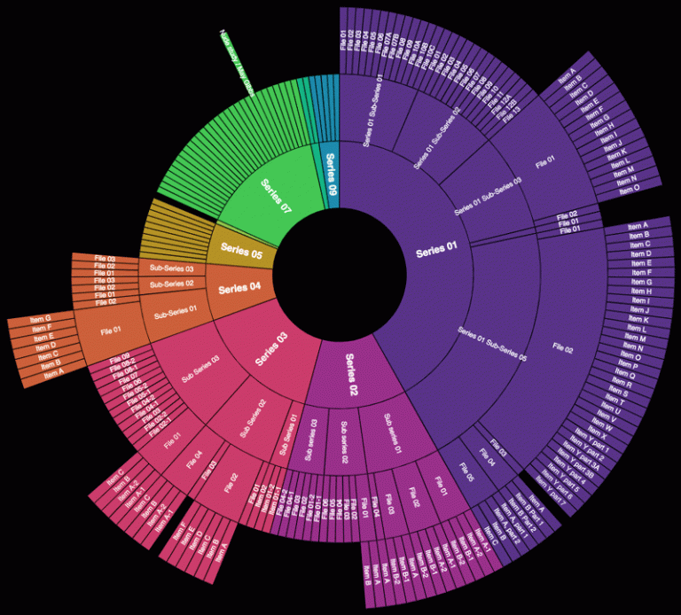
Sunburst
The sunburst chart is a well known way of visualising hierarchical data. Using the May Gibbs papers data, the chart gives you a good sense of the size of container records. Series 01 is clearly the largest, with more sub-series than any other.
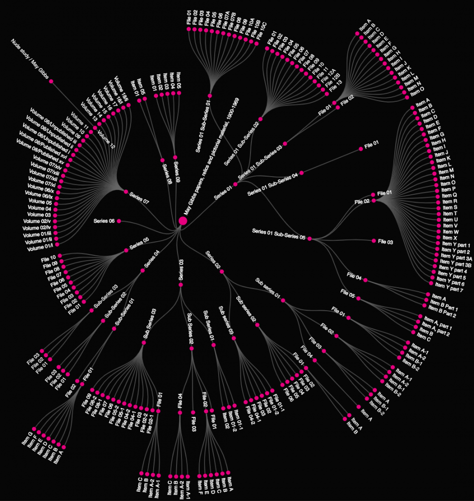
Radial Tidy Tree
The chart below represents all the records in the May Gibbs papers as a radial tidy tree. In the centre is the root record, with 9 child records (Series 01-09) coming out from the root. You get a good birds-eye view of the May Gibbs papers, being able to see at a glance the structure of this dataset.
Both the sunburst and radial tidy tree are great at visualising the hierarchy as a whole, but they would still be problematic for larger hierarchies.
Joseph Banks website
We continued our research and found some inspiration from the Library’s own Joseph Banks Papers website. This is a custom interface built to navigate and explore over 2000 records from this significant Library collection. One of the most interesting features is the expandable breadcrumb component built by Holly to navigate this complex hierarchy of records.

The way that each level can expand both horizontally and vertically made it quite clear how deep and far down a list you were. This idea seeded further exploration into other applications.
Mac OS X Finder
As we searched around for inspiration, we noticed that the Joseph Banks hierarchy interface slightly resembled Mac Finder’s column view:
As mentioned before, computer files and folders make a neat analogy for collection hierarchies, where records can be containers (folders) for other records (files). This column view highlights the current file and shows the surrounding context, with child and ancestor records readily accessible.
Selecting a file also shows a preview with some metadata in the last column:
As daily Mac OS users, our solution was actually under our nose the whole time! We decided to take design cues from the humble Mac Finder knowing that it is a purpose built file navigator, with great UX fine-tuned over two decades of use. In fact, this type of interface is called the Miller Columns, originating in 1985 and well suited to solving our particular hierarchy issues.
Design and build
With the Mac Finder column view as our inspiration, we sketched out some ideas for our hierarchy browser:
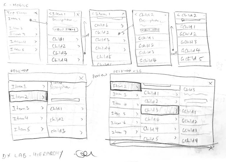
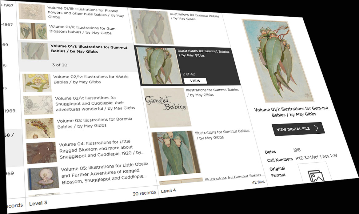
We proceeded to build the interface with real data. The May Gibbs dataset was particularly useful during development as it had images and was not overly large (240 records). It was also perhaps the deepest hierarchy we encountered, ensuring our code would work for shallower hierarchies.
Here is final product with the May Gibbs hierarchy, starting at the root level:
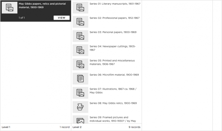
At the bottom of each column, you’ll notice that we are using the term ‘level’ to indicate the depth of the hierarchy. We’ve found this to be more approachable and consistent compared to existing Library terminology.
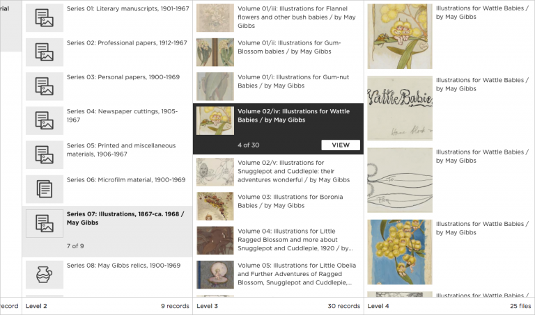
Clicking on Series 07: Illustrations 1867-ca. 1968 / May Gibbs reveals the child records:
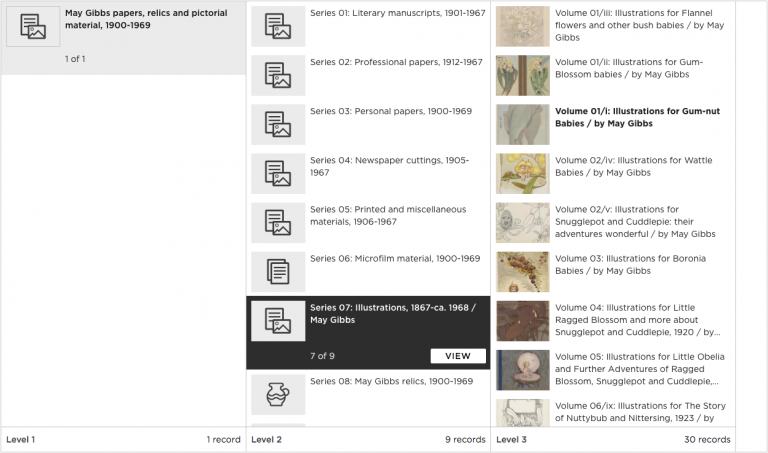
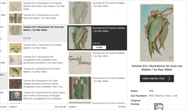
Clicking on Volume 01/i: Illustrations for Gumnut Babies / by May Gibbs partially shows digital files of that record, encouraging the user to scroll to the right:
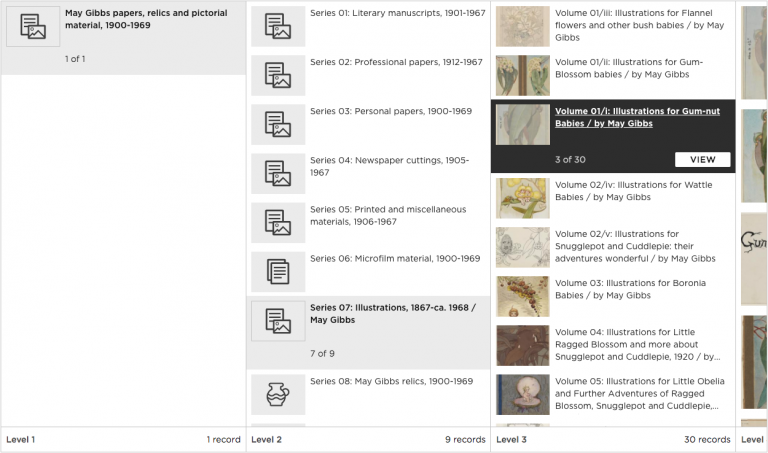
The second digital file, Illustrations for Gumnut Babies / by May Gibbs is then selected and shows a preview of the file:
View Button
Although the Mac Finder and our new Hierarchy Browser have many similarities, there is one key difference. To open a file in Finder, the user double clicks on it, but as ‘double click’ on the browser is a very uncommon interaction, we had to look for another solution. We could potentially navigate to a new page on a single click, but that would prevent the user from exploring the surrounding hierarchy.
The solution was actually pretty simple, on the selected record we expand the height of the row and show a button to ‘view’ the record. This way, the user can inspect the various parts of the hierarchy without leaving the hierarchy browser.
Auto-scroll
One thing we noticed with the Mac Finder was that when you clicked on a file or folder, it would automatically scroll to the right, revealing the next column’s content. This is a subtle UX touch, but it lets the user know there is more content to explore. We implemented our own version here:
Again, note the preview pane, with link to the record and light metadata in the last column. This allows the user to browse through the hierarchy quickly without committing to the full record.
Digital Files
Some collection records have digital files associated with them, such as images, audio or video. While these are not strictly part of the archival collection hierarchy, in the context of a public facing collection interface, we felt that it was important to provide access to these assets. It also serves as a connection point between our new collection and digital portals.
Below, we are showing the digital files attached to Volume 02/iv: Illustrations for Wattle Babies / by May Gibbs. Note that the files have much larger thumbnails than the records.
Mega-Lists
Due to the nature of the Library’s data, we faced a few technical challenges when building this component. Most important was dealing with thousands of records and keeping the interface performing well. Referencing the APA collection as our upper limit (48k), we used a JavaScript library to render long lists of rows while still keeping the UI smooth. This library uses an efficient 3D game development technique called occlusion culling to only render items that are in view.
The list above has 47,896 records, but only 10 or so are rendered at any time in the browser. The application stays performant even when scrolling. Note that we have also added lazy loading, where there is a brief view of some placeholder records before the we load the next group of records.
Tree View
We felt that the traditional tree view still had merits, so we designed a tree version of the hierarchy browser to sit in the record page, enabling immediate access to ancestor and child records.
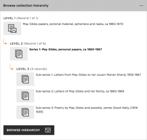
This view may suffice for smaller hierarchies, however our main column based hierarchy browser can be accessed for larger and more complicated hierarchies by clicking the Browse Hierarchy button. The main Hierarchy Browser then opens in a modal.
Code and Data
We know the Library’s hierarchies ranged in great size and depth, however the backend team was able to supply all the data we needed for the hierarchy browser with their new API platform. The backend/infrastructure team have written an in-depth blog post on the new systems architecture.
Regarding the frontend, the hierarchy browser and complete collection frontend is built with React, a popular open source JavaScript UI library. You can read more about the frontend architecture here. The DX Lab website, #NewSelfWales and The Diary Files are also built with React. By standardising around this UI library, it allows the Lab to incubate experimental components that could be used down the track by the collection website or by other Library projects.
A lot of work has gone into this interface so we plan to share the hierarchy browser as an open source component in the future.
Feedback
We’d also love to hear your feedback on both tree and column variations of the hierarchy browser on collection.sl.nsw.gov.au, especially for larger hierarchies. There is a blue Have Your Say feedback widget available on every page and we’ll use these comments to continually improve the interface over the next few months.