New digital experience
The DX Lab in partnership with Macquarie Group, opened a digital experience in the foyer of the Macquarie Group banking chamber at 50 Martin Place, Sydney at the end of December. For more than a decade the Macquarie Group has provided support for the State Library of New South Wales and its innovative digital initiatives around the conservation of the the Lachlan Macquarie and Macquarie Family papers. These documents are among the most important records of Sydney and the early colony and represent a surprising vision of the modern metropolis that Sydney would become.
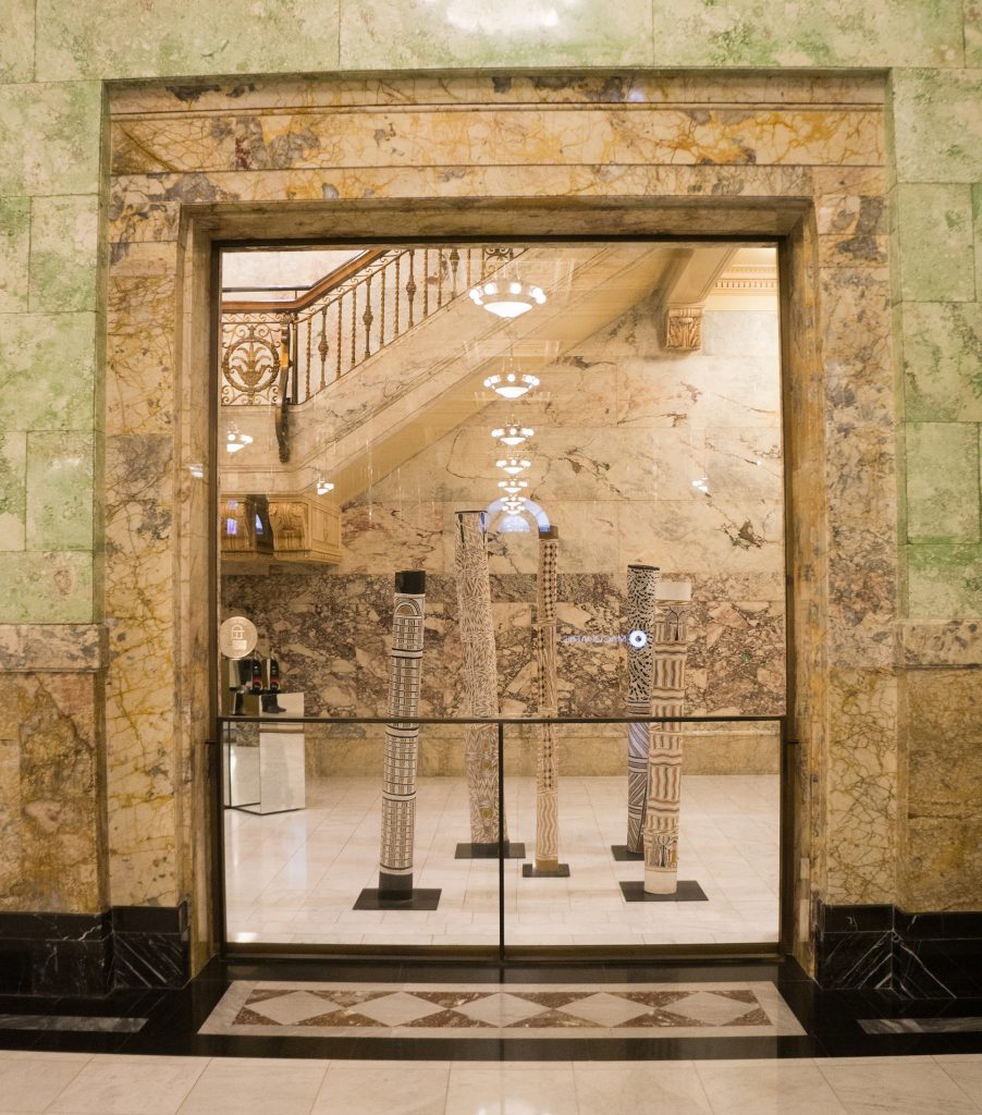
As part of this partnership, that also supports the Young Creative Technologist Award, Macquarie Group requested the DX Lab design and build an interactive digital experience, using the Library’s Macquarie papers collection as the basis for the foyer of the banking chamber. This location proved to be quite a tricky one as the heritage building limits how and where such a digital interactive can go. Working with the confines of an architectural element is a design challenge but one that is interesting to investigate as sometimes these can prove to be the more delightful and surprising experiences that audiences can have in a world filled with digital screens and devices.
The concept was to use the Governor Macquarie papers, images from the Library’s collection, modern images of Sydney and informative data about transport flow and population growth, to make something visual, dynamic and engaging. The DX Lab selected the large glass window space due to the scale and ability to rear project onto it, which meant that we didn’t have to have any impact on the physical parts of the heritage building. This space also has the highest impact of audience traffic in front of it as clients and staff enter the building.
This digital experience was developed through the State Library of NSW Foundation – proudly supported by Macquarie Group.
![]()
Creatively the project was exploring a theme of the realisation of plans and dreams and the passing of time. We wanted to explore how to make the production responsive in some way, provide a role for the audience to effect the experience, and a small element of variability that was a reward for viewers who took a moment to connect with the work. The project was to be a visually stimulating display but it is also one that stands on the shoulders of vast amount of research, historical records, and raw data about how a city lives and thrives.
The following is by Leonie Jones, the Media Producer, on the production of the experience.
The journey through the realisation of Governor’s Macquarie’s vision unfolds through five components of the installation and below I’ll break down both how I addressed these big challenges and executed them in technical production.
Part 1 – Visionary – The Macquarie Papers
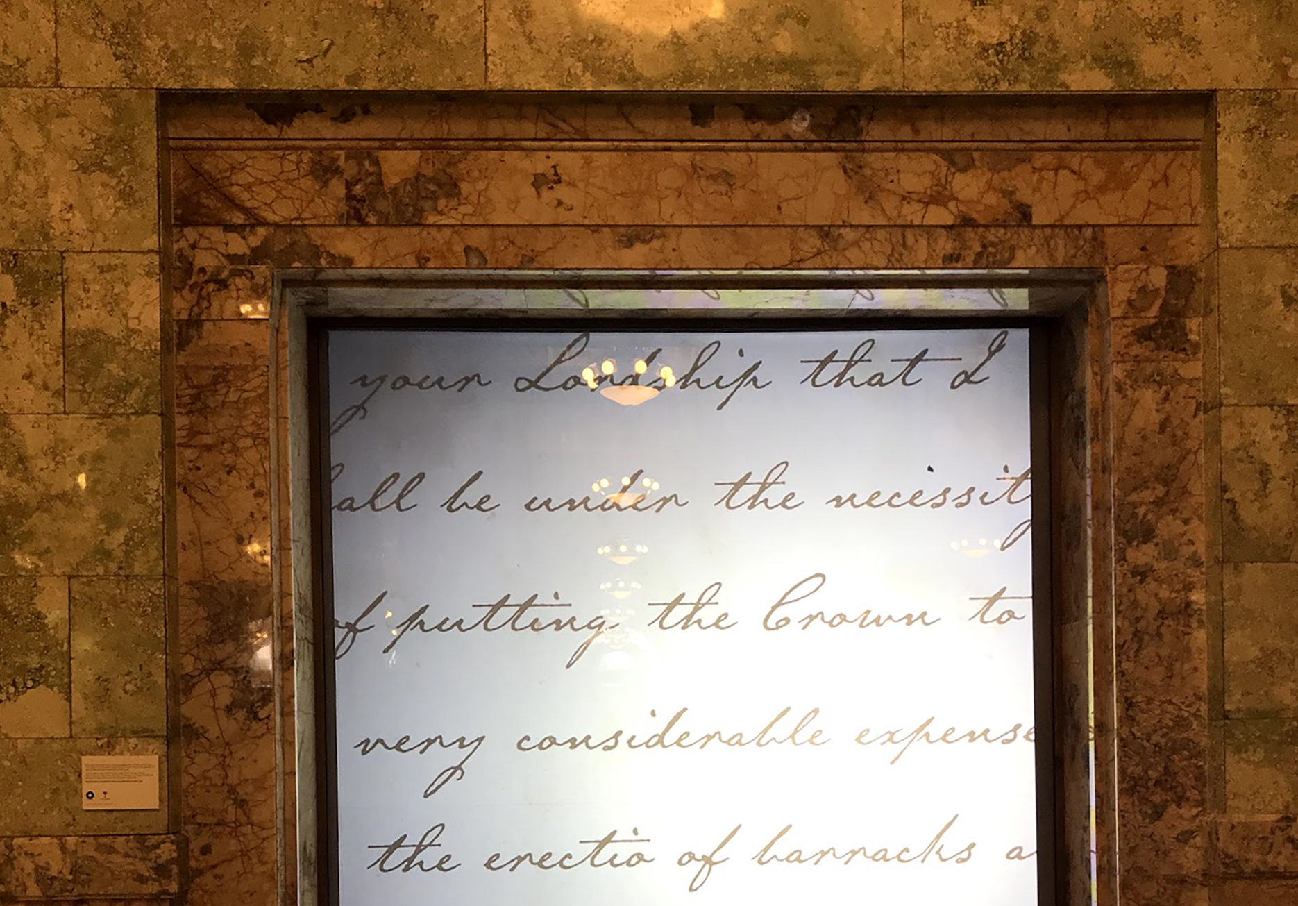
In this first section the viewer visually drifts though the letters, notes, and journals of Lachlan Macquarie; with the scale of the projection prompting the viewer to feel as if they are falling through the hand-written papers. Some are detailed official observations, others offer more personal commentary on events, while further notes are private thoughts shared with colleagues, friends and family.
Using high resolution scans of the original documents from the library collection, I placed these into a three-dimensional composition using Adobe After Effects – a software system for arranging and animating visual media. The scans are placed as layers and each layer is positioned at an equal distance from the others in depth – otherwise known as Z-Space being the Z axis in an X-Y-Z arrangement of coordinates. Into this 3D composition I created a virtual-camera to serve as the audience’s point-of-view. The camera was then animated to move smoothly through the layers of papers in a dream-like drift.
To add a personal element to this I wanted to emphasise the hand-written intimacy of the documents. So, interspersed within the fly-through of the virtual camera was a selection of handwritten quotes from Macquarie that were animated to appear as if being written in time across the screen. This took careful matching of font and individual key-frame animation to mimic Governor Macquarie’s own hand.
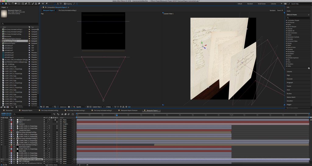
Macquarie Papers AE Screen capture of handwriting animation
Part 2 – A Landscape Transforming – Panorama
In the second section of the experience, the viewer is transported to a wide painted landscape of Sydney as it was in 1821. Here we see a gradual reveal of the growth of the built environment during Lachlan Macquarie’s time as Governor of NSW; a transformation of the landscape and the creation of the first buildings that would become a modern city.
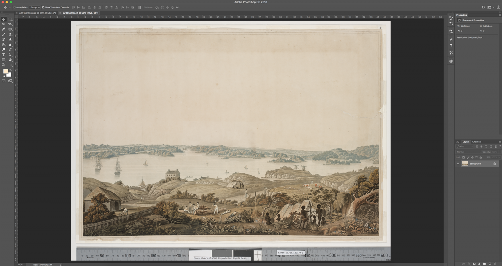
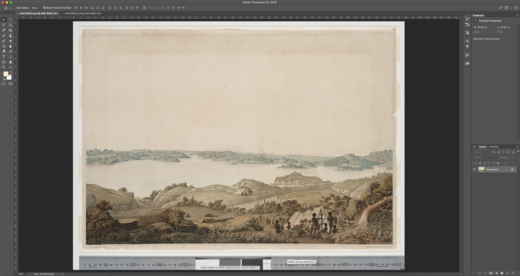
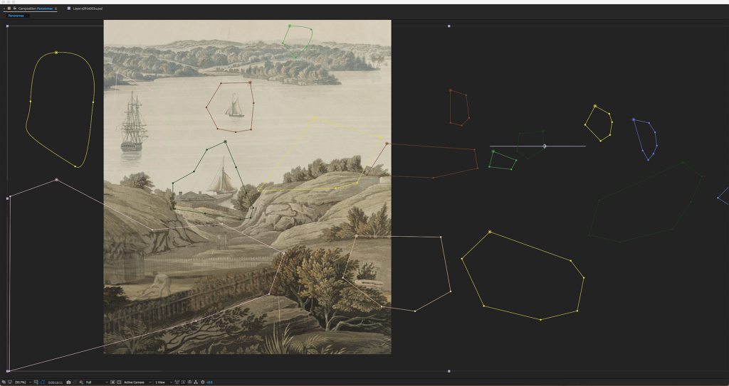
This section was based on a spectacular panorama painting of Sydney taken from Observatory Hill by Major James Taylor in 1821. The panorama shows the town of Sydney as it looked at that time that Macquarie was nearing the end of his governorship. A high resolution scan of the panorama was used to fill the projection space in a vertical slice and allow for an elongated panning movement across the scope of the artwork. The intention was to create an experience of seeing the painting transform before our eyes, from natural wilderness to a built environment.
Using Adobe Photoshop, and careful hand ‘air-brushing’, I digitally erased all the buildings and European people from the original painting and re-painted their backgrounds, using a combination of the Spot Healing Brush – Content Aware Fill, the Clone Stamp and the Brush Tools to manually replace the erased elements. This edited panoramic image was then placed into an After Effects composition and the previously erased elements placed in a new transparent layer. Using masking effects the built environment could be slowly revealed as a progressive animation; one that showed each building, ship, and person incrementally unveiled. The effect is ultimately to take the static nature of Major Taylor’s panorama and transform it into a dynamic depiction of how Sydney developed so dramatically in those years.
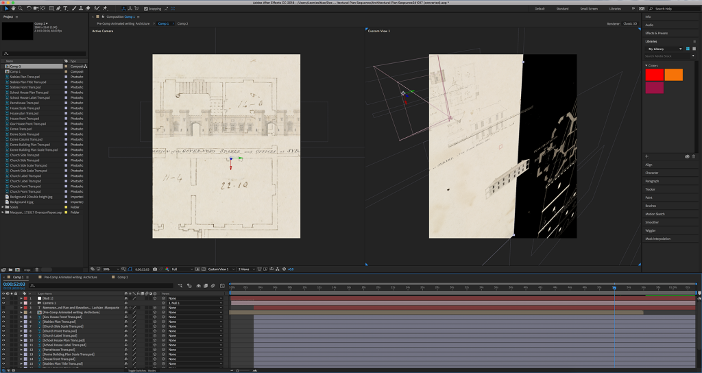
Part 3 – Building The Colony – Architectural Fly-through
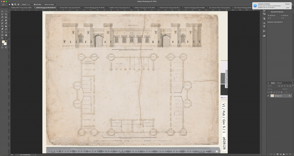
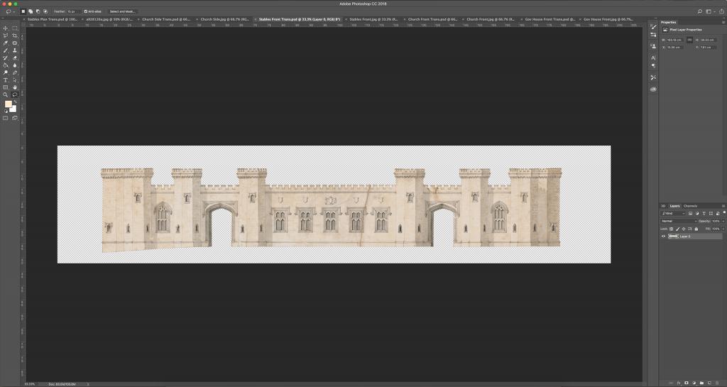
This involved taking the viewer on a 3D fly-through experience allowing you to explore Governor Macquarie’s ambitions for Sydney in the architectural plans and elevations for the extensive array of public buildings he commissioned.
As Sydney’s first town planner, Macquarie engaged craftsmen and artisans, often from the ranks of the convicts such as Francis Greenway, to realise his ambitious program of public works – parks, roads, townships and, above all, gracious public buildings. The plans included in this section are all buildings designed by Francis Greenway, many of which are still standing today.
To create this effect I employed a similar technique to that used with the Macquarie papers in Part 1, where the viewer is led through the layers of content via the use of a virtual camera. However in this case, I first took the architectural plans and traced the building plans and elevations and digitally removed the backgrounds to create line drawings in Photoshop that could be stacked in layers in After Effects. Using only the line drawings without backgrounds allowed the virtual camera to fly through the buildings windows, doors, and apertures. The ‘falling’ effect of this projection aimed at moving the viewer not just over the plans with a traditional bird’s eye view, but that of moving through the plans as structures and spaces.
Part 4 – Sydney Then & Now
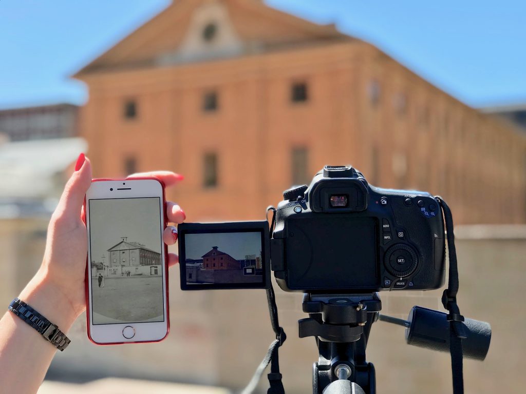
This part of the experience brings past and present together into blended images of iconic Sydney buildings designed by colonial architect Francis Greenway. The transition from 19th century archive photographs to the same building in it’s contemporary setting, seeks to provide the viewer with a clear connection between Sydney then and now. Each building is still in use as a public building and is a testament to Governor Macquarie’s long term vision for Sydney.
The original 19th century images came from the State Library of NSW collection. To re-create a matching contemporary photo required careful recreation of the same vantage point and angle. Modern structures, and roads made this difficult, but by having the original photo on location with me as I took the photos and carefully manipulating the perspective of modern images in Photoshop after the shoot, I was able to align the architectural features. I did this by layering the modern image I had taken over the top of the old photograph and reducing the opacity of the top layer so I could see the one below. Then I adjusted each angle in 3D space using the Perspective Warp and Free Transform tools to match both images as closely as possible.
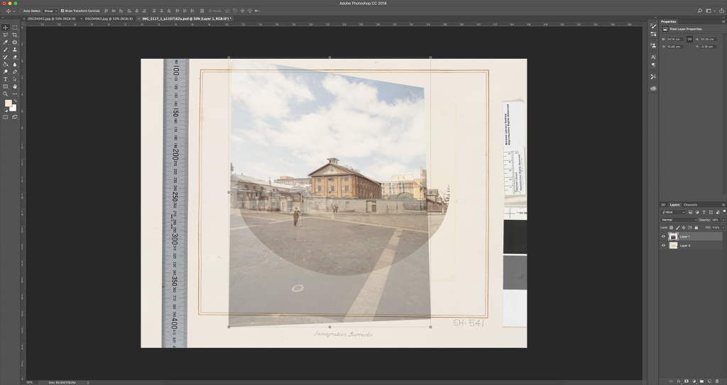
With the two images in place in After Effects as seperate digital layers, I then designed a custom shaped mask to allow for a slow, organic, transition from one layer to the next – slowly revealing the new over the top of the old.
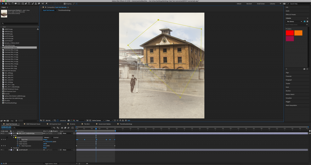
The buildings included: New Parliament House, Government House Stables (now Sydney Conservatorium of Music), Old Supreme Court, St James Church, The Mint and Hyde Park Barracks.
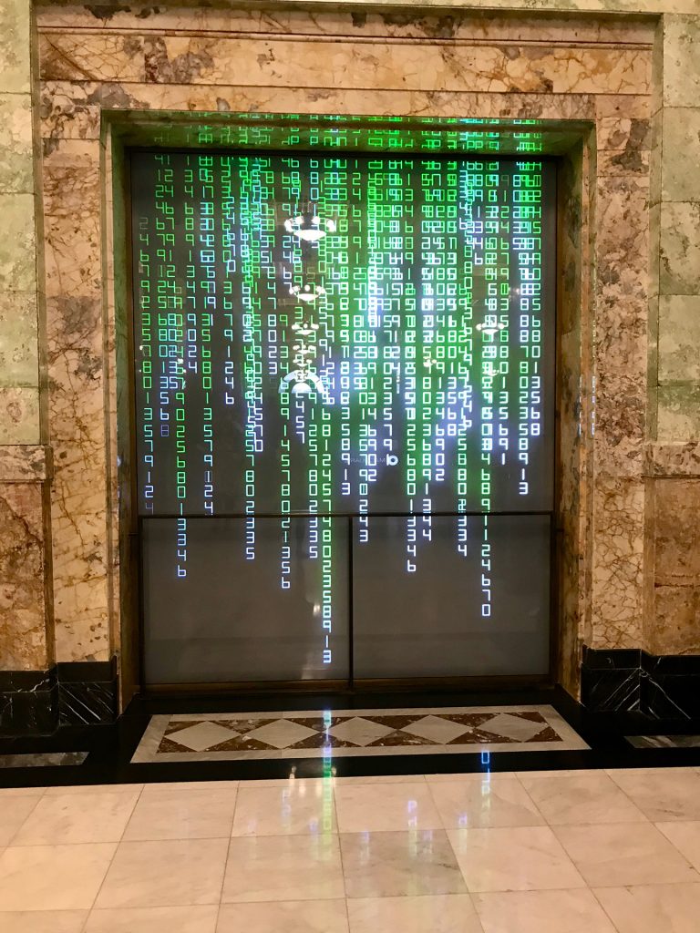
Part 5 – Data Visualisations
A strong interest of the DX Lab is the interpretation and communication of data sets that explore the library’s collections in new and innovative ways. In this regard, making modern data that reveals the inner workings of a modern city, central to the experience of the Macquarie project was always an important objective.
The data we used was open source Opal data from Town Hall, Martin Place, St James, and Wynyard train stations in Sydney, along with Census data of Sydney’s population from 1796 – 2016. Macquarie believed that the civil and public works of a city were crucial to its development and progress. Data of this kind illustrates a city that has grown into Macquarie’s vision.
For the viewer of the experience this is the moment when the modern transcends the past. It is activated through an interactive sensor triggered by the viewer themselves. Their proximity to the installation – hopefully driven by curiosity and intrigue – sets off a fast paced flickering montage through history; Nineteenth century maps, landscape paintings, photos and elevations of Greenway’s buildings, portraits of Governor Macquarie, to arrive at a modern data visualisation of how the city moves and breathes.
To create this effect I first created the flickering sequence which appears to the viewer like a digital glitch to signify that their presence has caused a rift in time as we rush through history to the modern day. I made this glitch sequence within After Effects using Adjustment Layers and Displacement Layers over the top of the historical images to give a distorted and warped look, like digital interference. I then took the raw transport and population data and within After Effects, animated it to conform that information to a visual pattern. The effect was to have the information fall down the screen like rain. This was a painstaking animation process. There were eight final data rain sequences, each one containing six nested compositions, and each of these with more than one hundred layers.
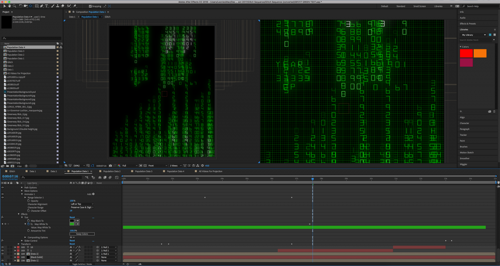
In the final moments the data comes to rest revealing the meaning of the information – the specifics of a particular moment in time for the city of Sydney. To achieve this I used custom programming scripts – known as ‘expressions’ – to create an animated odometer effect of scrolling numbers and letters ticking over and coming to rest on a final reveal.
Presentation
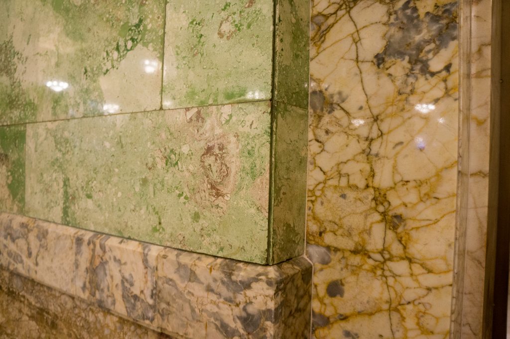
In the creation of all the content I was specifically mindful of the natural colour palette of the building itself and in particular the hue of the marble. At the outset of the process I captured reference images within the building from which I then digitally sampled the colour shades to ascertain their computer-based RGB colour values. I then replicated these in the tones and shades of all the visuals in the content production. This included everything from the colour grading of the parchment tones in the Macquarie Papers, to the colour hue of the raining data visualisation; every sequence is a tonal match to the building itself.
The interactive element of the installation required careful planning as the only cabling that could be used was behind the 15mm toughened glass window. This meant that any sensor needed to be installed behind the glass. The best option was to use a microwave sensor as it was able to operate through the thick glass by continually scanning the environment and reacting to any changes in the immediate vicinity.
The content projection required playback from a dedicated media player with 4K capability – a resolution which is four times that of HD. Interactive playback in the installation was made possible by programming the player to read the trigger input from the microwave sensor as a command to play one of the eight data visualisation sequences at random. The player also plays a random data visualisation sequence after a certain period of inactivity from the sensor. Given that the foyer has a high volume of passing traffic, a short ‘wait period’ was added after each interactive trigger before the next trigger could be accepted, avoiding constant triggering during busy foot traffic times.
Of course all the content, interactive components, and mechanics of playback are only in service of the projection itself. An Epson 4K laser projector was chosen for filling the 3m x 2.5m screen. This projector has a very high 12000 ANSI lumens rating ensuring the image is bright and clear even within the cavernous foyer.
You can view this digital experience at 50 Martin Place, Sydney until May.