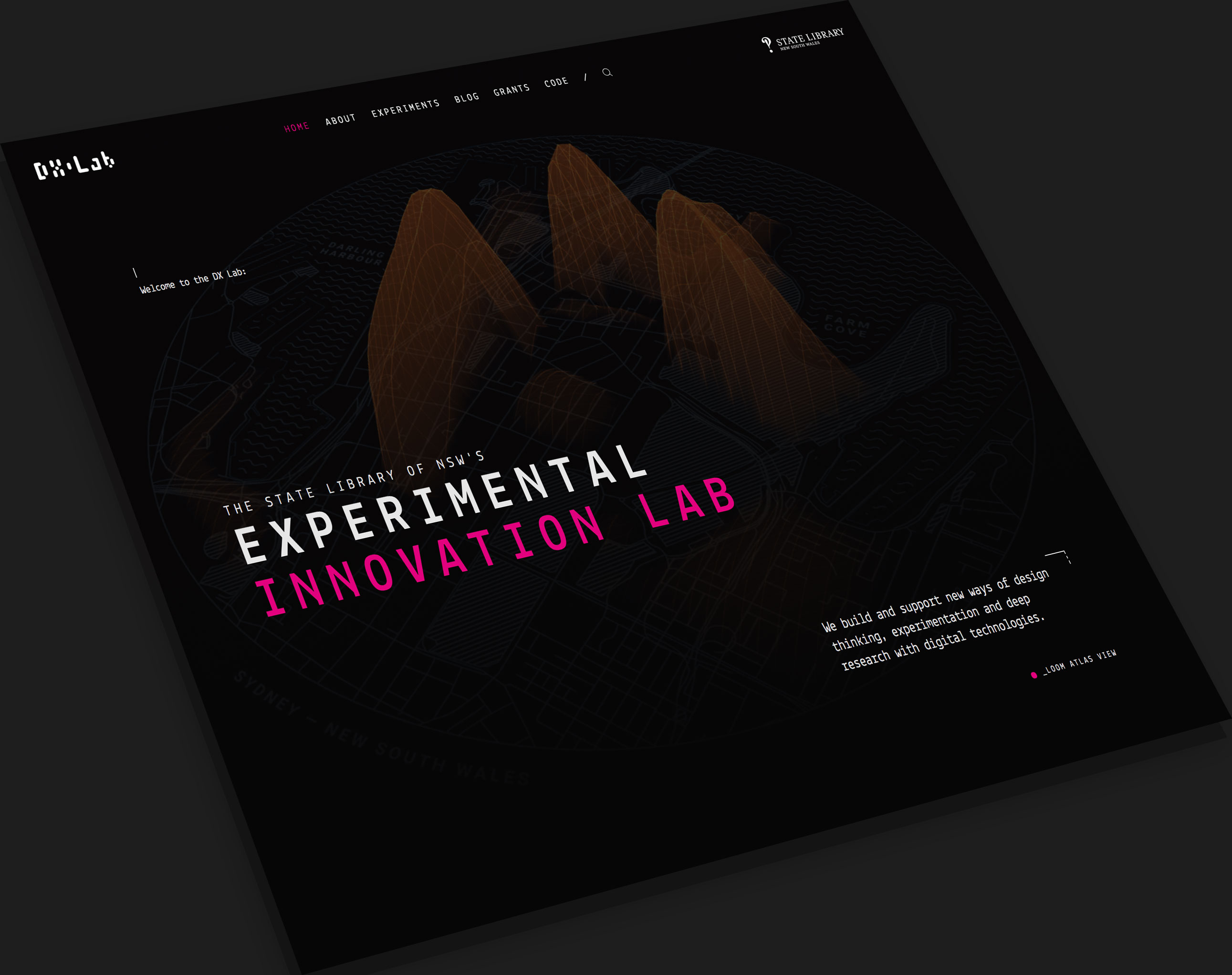
New DX Lab Website
You may have noticed that our website has got a bit of a facelift. After a few months of work, we are now officially live with the new redesign. This post goes through our design process, technical details and future plans.
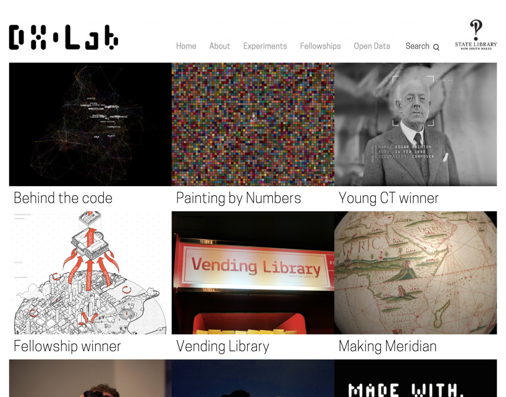
Our old website had served us well, but it was quickly put together in time for DX Lab’s official launch in May 2015. Over the last two years, we started to outgrow our old blog style format and felt the need for change.
This redesign isn’t just a new coat of paint though, we completely re-architected our humble monolithic WordPress site and decoupled the frontend (React), backend (still WordPress) and even added a new API layer in between (GraphQL).
Before getting into the technical stuff, let’s talk about the design first.
Design
The previous DX Lab website worked well for a simple list of blog posts, but it was starting to get unwieldy with over 50 posts and counting. The relationship between experiments and posts was also not always clear. More importantly, we wanted the website to truly represent the DX Lab’s playful and experimental nature.
In our research phase, we looked at other creative labs and particularly liked Google’s experiments portal. We wanted to push the boundaries a bit more, so we browsed through edgier design agency sites (some examples here, here and here). We figured a portfolio of work was similar to our self contained experiments.
Sketching and Sketch
Putting our screens away and picking up our pens, we started drawing. We wanted to see more context about the DX Lab. Experiments needed to feature as well. Despite how embarrassingly amateur this is, here is a *very* rough early sketch of the home page.
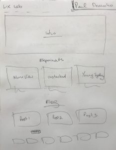
It was important to give some context, especially to new readers about the DX Lab. We used a large intro masthead to help explain our role. From internal feedback, we also wanted our experiments to feature more prominently on the home page.
From those early ideas, we moved to the screen and started designing in Sketch. If you are not familiar, Sketch is part of a new breed of digital-first design tools. We took advantage of Sketch’s symbol feature to create reusable and resizable components to build our designs. This component based approach is also how we developed the website.
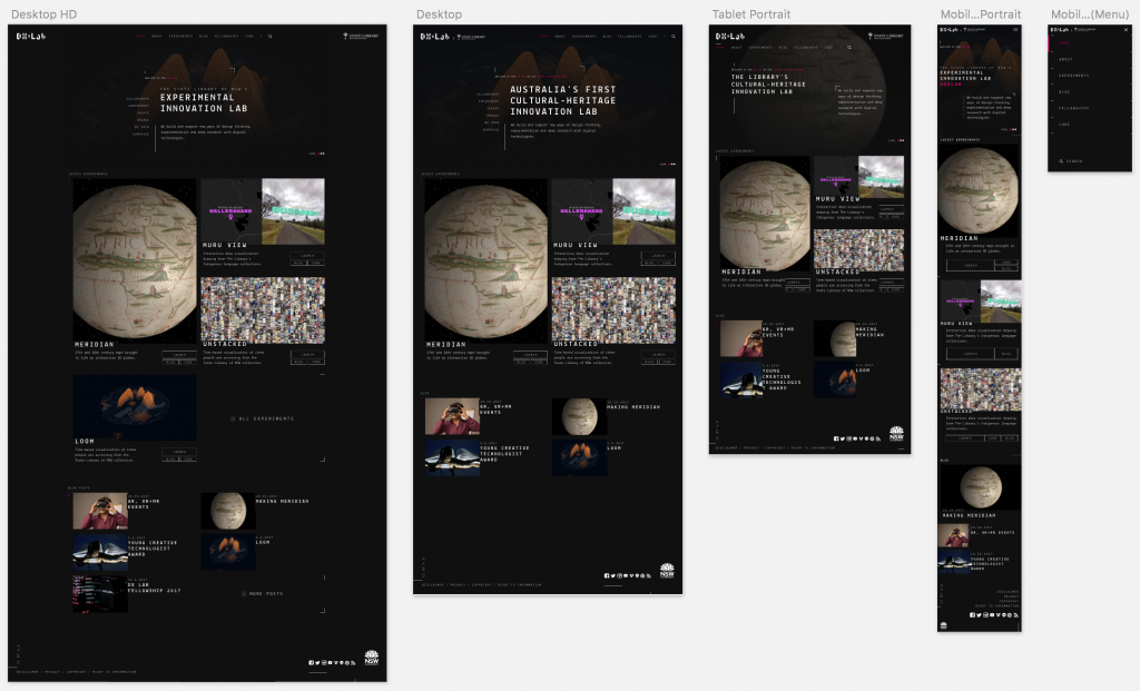
Like Google’s Experiments site, we went with a dark background to bring more mood and mystery. In a similar vein to how our experiments are built, we wanted the design to have a unfinished, in-progress feel, with judicious use of ‘crop marks’ and other technical symbols (surprisingly tedious for our frontend developer to add…). We may have also been influenced by Bladerunner’s 2049 UI aesthetic.
Headless WordPress
The old site was built entirely on the popular WordPress CMS. When evaluating our options, we noted that the Library mainly used Drupal. Despite this, we decided to continue with WordPress for several reasons. Firstly, the team had a lot of experience in administering and coding WordPress (DX Lab Developers Kaho and Luke both worked on maas.museum’s WordPress site). Secondly, migrating data would also be much more straightforward.
Perhaps the most compelling reason is WordPress’ new fully featured REST API. WordPress data is now accessible to other platforms and programming languages. This makes decoupling easier, allowing developers to break away from building template based sites in PHP/Wordpress and use more modern frameworks.
Angular, React and Vue are probably the three most ‘in’ frontend frameworks right now. Due to Kaho’s previous experience and its growing popularity, we went with React.
By decoupling the frontend, WordPress essentially acts as a ‘headless’ CMS backend, purely used for managing data and media. We potentially future-proof our stack, allowing the frontend and backend to be updated independently.
Tech
- Trellis – Infrastructure and local environment framework for WordPress
- Bedrock – Modern WordPress boilerplate
- Ansible – Deployment automation
- AWS – Amazon Web Services, cloud provider.
GraphQL API
Not content to divide our monolith into backend and frontend, we squeezed another API in between! The diagram below shows a new API called GraphQL that gets data from WordPress and then sends it to our frontend DX Lab website.

While this adds more complexity to the stack, GraphQL has certain advantages over traditional REST, such as fetching only the data you ask for and fetching across data types in one go. This keeps our frontend code simplified and further decoupled from WordPress.
GraphQL is actually data agnostic, so it is possible to fetch across data types AND data sources, all in one go. Our end goal with GraphQL will resemble the diagram below:
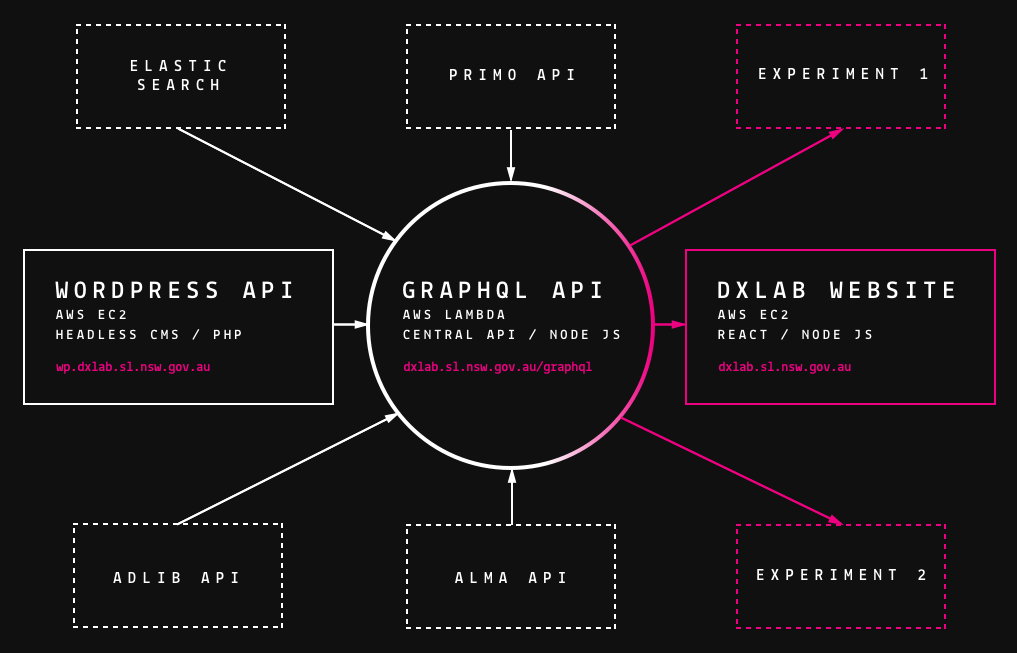
The Library has many different systems and APIs. We plan on using GraphQL to fetch these too, so our frontend website can easily get data from these other sources, without fetching them individually.
GraphQL Tech
- GraphQL – Flexible API query language
- AWS Lambda – ‘Function as a Service’ with no need to maintain servers or scaling.
- Serverless – JS Framework for managing AWS Lambda and other serverless platforms.
- Node JS – Javascript server side platform.
Universal React Frontend
As we mentioned earlier, the frontend website uses React – a popular Javascript UI library built by Facebook. Other notable websites that use this library include Twitter, Instagram, New York Times, Netflix and Airbnb.
React typically runs as a single page application (SPA) in the browser. Because we are using Node JS as our frontend server, we can also run React on the server too – essentially creating a Universal Javascript application.
The main advantage is the ability to share almost all code between browser and server, something not possible with other platforms like PHP, Python etc. It also means there is less context switching between languages.
This style of application has performance advantages too. The initial page load is server-side rendered, but subsequent page views only fetch data from the API and don’t hit the frontend server again. With this technique, we get the advantages of both server side and single page applications in one package.
We weren’t satisfied with next-generation architecture and high performance though…
ASCII Art Character Shuffler
Taking inspiration from ‘procedural’ graphic designer Andreas Gysin’s ingenius ASCII art shuffling animation, DX Lab Developer Luke Dearnley whipped up something similar for our page titles. The shuffling finishes at different times for each character, to create the feeling that the title was gradually settling into its correct form.
We had almost perfected the code when State Librarian John Vallance dropped by. After showing him the text shuffle he made a suggestion to leave one incorrect character after the shuffle finished, for a second or so, causing the more observant viewers to think something had gone wrong, and then flip it to the correct letter after that. This was an unexpected surprise and consequently makes the text shuffle even better.

Because too much shuffling is never enough, we finally added some more code which briefly disrupts the settled titles back into a shuffling state if you mouse-over it (try it yourself on the home page).
404 Maze
In the course of exploring Gysin’s portfolio of work, Luke was captivated by the animated and often interactive headers he has on his archive pages (here, here and here).
This header in particular stood out, where a series of blobs wander randomly under the title, leaving trails of various densities. Somehow these wandering paths reminded us of mazes. We liked the parallel between being lost in a maze and being lost within a website, which is of course what happens when you are on a 404 page.
While researching maze generation algorithms, Luke was amazed to find out that Conway’s Game of Life could generate maze-like structures if given a slightly altered rule set (rule-strings B3/S12345 and B3/S1234 for those algorithmically inclined).
Check out the result below:

Frontend Tech
- React – Javascript UI library by Facebook
- Next JS – Framework for building universal React websites
- Apollo – GraphQL client
- Prettier – Opinionated code formatter, also stops developers from arguing about semicolons
- CSSNext – PostCSS plugin to activate the latest in CSS syntax
What’s next?
With the redesign, we want to treat this website like a living style guide for our in-house future projects. This keeps new designs consistent and helps us iterate more quickly.
By splitting our old WordPress site into backend, frontend and GraphQL, we’ve laid some solid foundations for future projects. This modular microservice architecture means that each piece can be extended and re-used. For new projects, we don’t have to start from scratch every time.
Like our experiments, the website is in constant beta, please feel free to leave feedback below or use the Twitter combination #dxlab @statelibrarynsw.
We hope you enjoy the new website and we’d love to hear from you about this as we will be tweaking the design over the next few weeks.
Credits
Luke Dearnley – ASCII Art Title Shuffling and 404 page descriptions.


Comments
My compiments on a stunningy beautifu website – having recenty returned to a deveoper role I wi certainy be borrowing some of your ideas! And it’s even more important that you have shared the technica story. PS I am writing this on an od Mac which has ost a key – you can see which one can’t you! Perhaps this odd text wi provide some design ideas?
Regards
Susan