80Hz: part 3. Design
This post is the last of three which describe the results of Thomas Wing-Evans‘ DX Lab fellowship research at the Library, the outcome of which was the 80Hz Sound Lab interactive pavilion installed on the Library’s forecourt last October 2018. In this part Thomas describes the design process and fabrication. The previous posts are here, part one and part two.
Concept
Paintings are almost always associated with some sort of border – something to contain the image, frame the view, focus your attention and divide scene from scene. Frames have developed to serve other functions as well, like expanding upon the meaning of the image that they surround, commenting on it and relating to it – the carved reliefs in the palaces of Persepolis are bordered by eglantine flowers, which symbolise protection for the Babylonian warriors represented in the image. A frame can be many things; it can embody additional ideas, it can be an environment or a shelter, it can be in dialogue with the painting. This concept played out in the spatial qualities of 80Hz.
The cornerstone of the project was the paintings and how they were translated through sound. The role of the spatial elements were to protect, support and enhance the exploration of the images. To achieve this, each component was considered and constrained by having a structural, protective or communicative purpose – ideally a combination of the three. Further, each component needed to add to the dialogue of the experience as a whole. Superfluous elements were pared back as much as possible to bring the images and sounds to the fore.
Site
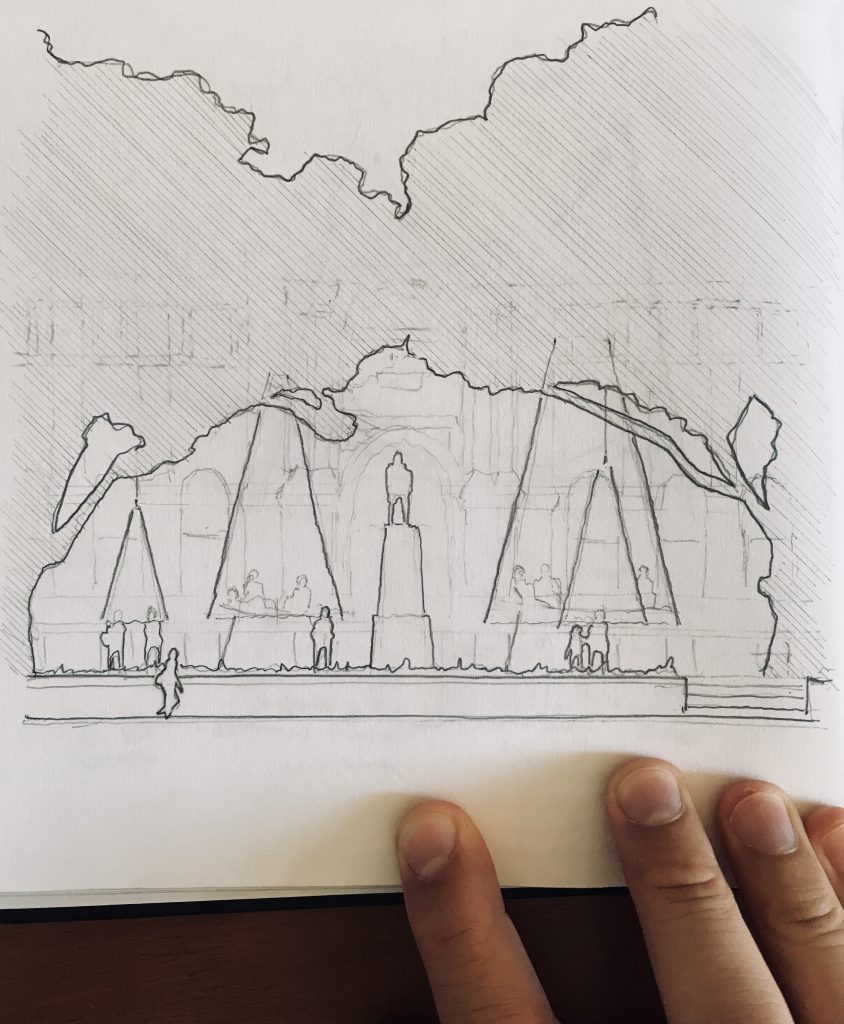
The Macquarie Street forecourt sits directly in front of the Mitchell Library. Two huge elm trees meet to form a natural proscenium arch over the statue of Matthew Flinders, making the space feel theatrical. Light shining through the tree canopy washes over the sandstone facade and paving, continuously changing the appearance of the site throughout the day. Yet, the space is interstitial and underutilised – it sits between entrances serving mainly as a shortcut to and from the Botanical Gardens. The site is in the centre of Sydney and steeped in history, but feels like it has little connection with the daily life of the city. For this reason, it was the perfect place to locate 80Hz. Locating this mysterious musical object on the forecourt would activate it, engage the public and create a new connection between the street and the Library.
Design Development
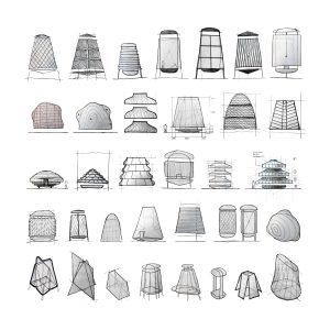
Form-finding for the physical elements required multiple design iterations to develop a coherent connection between the paintings, soundscapes and surroundings. An early proposal for the larger structure explored a theatrical, Rube Goldberg-esque procession of images that enveloped visitors and had a strong visual connection to the structure. Another scattered the images around the space on timber panels, able to be picked up and placed in a central ‘player’ like vinyl records.
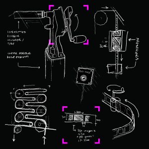
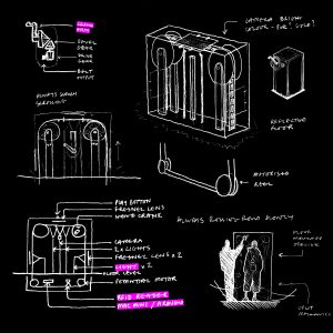
Although these proposals remained in the sketchbook, they were vital exercises to determine what worked and what didn’t quickly and efficiently. The act of manually finding and choosing a painting yourself was a strong idea that created a visceral connection with the collection. Using a crank handle as the mechanism to scroll through the selection was a direct reference to the Compactus storage units used in the Library’s underground stacks. Placing the images along a reel behind a clear screen was a nod to our digital culture and social media platforms like Instagram. Locating the reel on a glowing central column was designed to entice passersby and focus their attention, making the interaction intuitive. Creating a platform that raked upward at the edges lifted the visitors out of the city and allowed for audio equipment to be located under the floor, creating a haptic connection with the soundscapes and images. For the smaller structure the concept of a lover’s seat, where two or three people could sit together and listen to the paintings in sequence, encouraged interaction between members of the public. Each of these moments were borrowed from previous iterations and fed into the final designs that stand in the Macquarie Forecourt.
Digital Fabrication
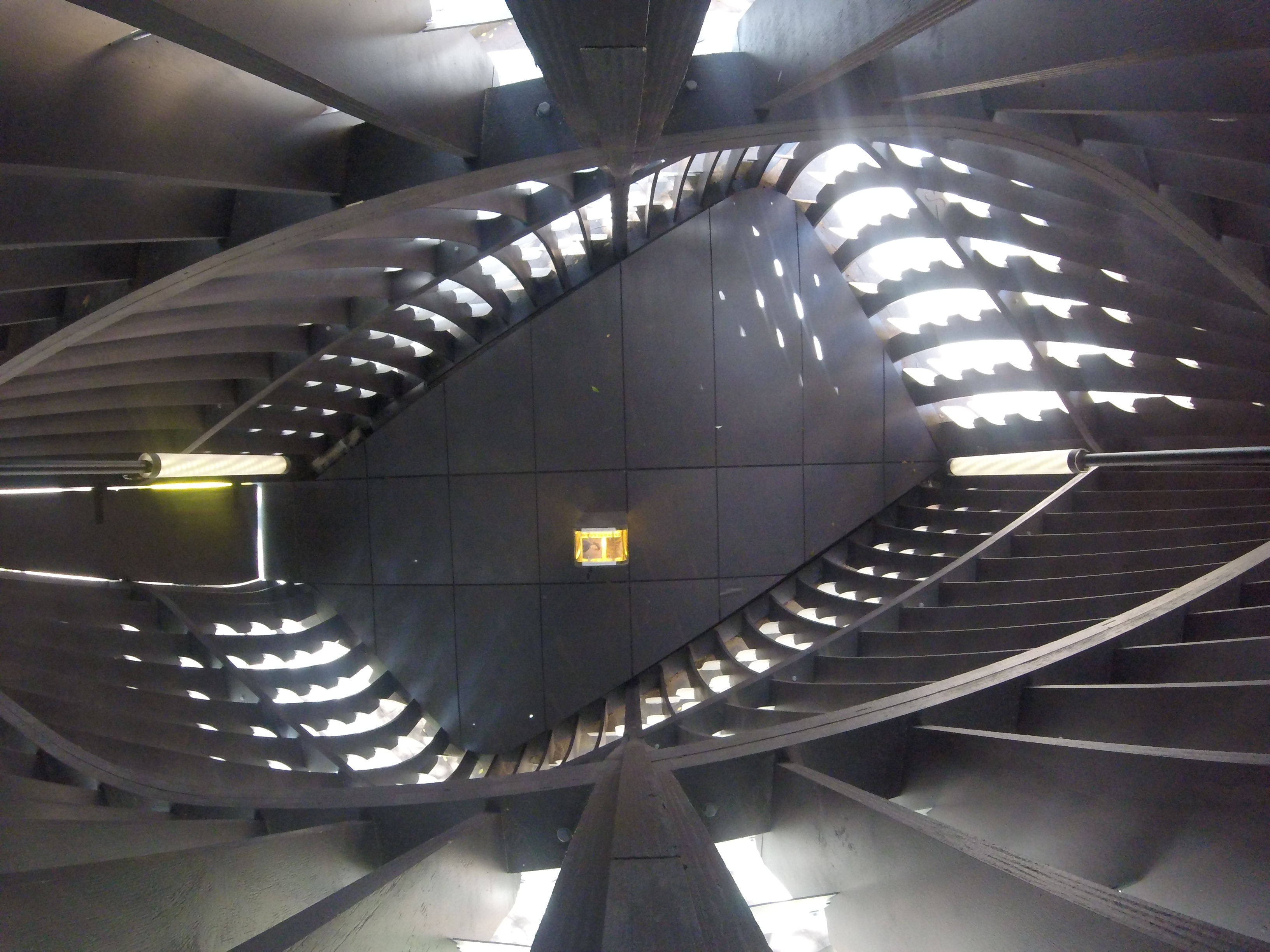
The things we envisage of when we think of this project – the paintings and the structures – are only real in a non-digital sense at the very beginning of the project (as physical artworks) and at the end (as a physical structure that generates sound) – everything in between is digital and ethereal. The paintings are digitised and the data is then extracted with a computer. That data forms the basis for an audio framework that is also developed digitally. Finally, it is a computer generating the final audio. Throughout the whole process, digital tools have as much agency over the finished result as the designer or developer. So, from the beginning a 3D computational parametric design process made the most sense conceptually, rather than traditional elevations and sections. Using Rhinoceros 3D and Grasshopper (an algorithmic modelling program for Rhino), I was able to develop a framework with a number of parameters based on acoustics, structural limitations and daylighting and so on. Other parameters like material sizes, costings and internal space requirements also feed into the framework. The space needed to feel intimate and almost secret, whilst also adhering to basic standards of scale, so getting this balance right was key. Not quite object, not quite building, the size of the structures was governed by a balance between council restrictions and space requirements – they could not exceed 6 metres in height (the larger stands at 5.2m), but had to be large enough to accommodate a group of up to 8 people (so far, the record is 16).
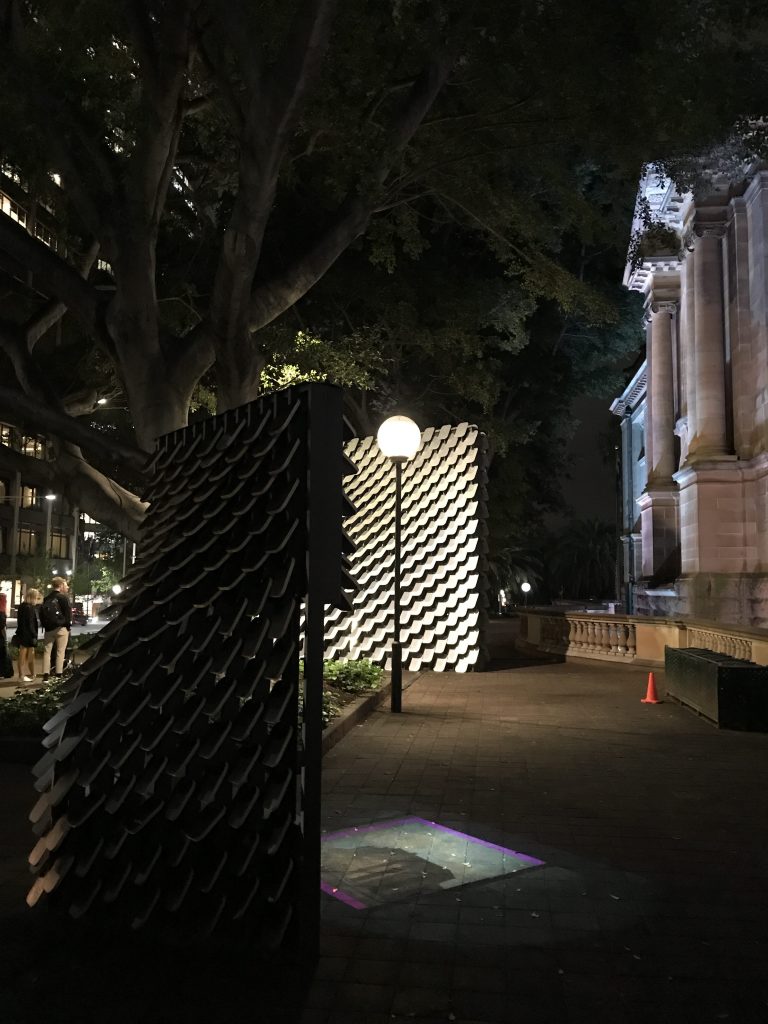
As with any project, but particularly on a project of this scale, it was important to design economically. By choosing the right materials and combining them in the right way they can dissolve into the background then be brought to life by light or sound. The metal has a second life in this geometric configuration as a reverberation chamber, but this only becomes obvious when the sounds play. The shingled cladding that covered the structure was defined by acoustic requirements, protection, lighting and weight to strength ratio among other things. Breaking the structure into small pieces like a collage had a byproduct which was a contrast between the black timber frame and the muted reflections of the metal. The timber frame had to be as slender as possible in order to let daylight in and give the space a feeling of openness. I chose to paint it black so that it didn’t command attention until lit from within at night, which passersby can see the skeletal silhouette which supports the metal cladding.
Technical Challenges
The fast-paced programme meant that there was little opportunity for in-depth testing of materials and mechanical components. Preparing for this limitation meant spending longer in the design phase simulating issues onsite and reducing the risk of failure. I provided structural engineers TTW with the 3D model, who used it to test weight distribution, structural stability and wind load effects. This was key, as heritage restrictions prevented the structure from being anchored to the ground in any way – it had to be entirely self-supporting and self-weighted.
The Macquarie Street site is very public and heavily used throughout the day, so the initial construction period needed to be as efficient as possible. I programmed scripts that would 3D model bolt holes, screw holes, lap joints and puzzle joints at the intersections of every timber member and at specific intervals to accommodate for sheet material sizes. Each half of the large structure was broken into 6 prefabricated panels that could be brought to site in a finished state and bolted together. Scripts were also developed to dismantle the entire structures digitally, number every piece then lay them flat for manufacture by a CNC (computer numerically controlled) cutting machine. This preparation meant that the onsite build only took two days.
Other challenges presented themselves as installation began, and later as the wear and tear on the belt mechanism set in. In the workshop space the belt mechanism, built into the floor of the structure, and its five rollers was nicely aligned and tweaked so the belt moved smoothly. Once the structure was relocated to its home on the forecourt, which isn’t perfectly smooth and flat thanks to the pavers, it became apparent that the belt was no longer behaving. Very slight tilting of several of the five rollers meant that the belt tended to migrate to the left or right as the handle was turned, eventually rubbing against one side or other of the interior of the column. This lateral force in turn pushed the roller against the opposite side, creating a braking force and the belt would get stuck. After much realigning of components of the central column, and very fine adjustments of the roller mounting points to get them horizontal, the belt was behaving again. It is definitely the mechanical parts which are the hardest to debug!
As time went on and the public used 80Hz in earnest, signs of wear and tear developed. The belt, being around 5.5m long seemed to slacken slightly, making it slip at times. It seems it had stretched about 2-3cm in length! Re-positioning the back roller was the easiest was to fix this, which had the side effect of needing to also relocate the RFID sensor.
Other wear and tear took the form of the image stickers cracking, bubbling or peeling off at the edges or corners. We had two more sets made and went through two rounds of replacing the worse ones each time. The first big replace was probably due to the rather terrible weather we had right after construction, and while fine tuning the rollers. This meant some rain managed to make it onto the belt, and this caused much of the bubbling and cracking.
Despite a lot of effort being put into the design of the base and central column to make it as air-tight as possible, over time dust and dirt made its way into the column. Getting between the belt and the main roller connected to the handle meant the main roller became quite scratched. The underside of the belt now also looks like it has had a sand-blasting. The finely ground belt and roller powder also made the belt slippy until we took a cloth to the length of it, and wiped it away.
All in all it had been a robust and resilient system, needing only a few brief bouts of maintenance during the display life during which thousand of visitors experienced the interactive.
Technical Appendix
Parallels Desktop
Rhinoceros 6
Grasshopper
Sketchup Pro 2016
Thea Render