Which Way the Wind Blows
The DX Lab is thrilled to announce the results of the Digital Drop-In with Small Multiples, Which Way the Wind Blows. This experiment, created by Chuan Jia (Jack) Zhao and Harry Morris, is the first digital project to come from the Vizie API. It has been a delight to have a project produced by Small Multiples as we have wanted to collaborate with them for a long time.
We are excited to announce that the API is now public and we are looking forward to seeing what others can do with this resource.
‘Since 2012, the Library has archived tens of millions of publicly available social media posts using the CSIRO’s Vizie tool. This partnership with the CSIRO’s Data 61 Lab has become a new pillar in the Library’s Digital Collecting Strategy. While the collection is a rich and versatile resource for researchers, its existence and purpose are less apparent to the people outside of the research community.
Vizie enables library staff to add hashtags and terms to collect continuing public discussion online. In the pre-internet era, libraries were reliant on letters and printed material to collect and interpret history. Tools such as Vizie provide the Library with an opportunity to collect the contributions of regular Australians to larger conversations in the public sphere.’ Sean Volke, Online Resources Specialist Librarian
Post below by Chuan Jia (Jack) Zhao
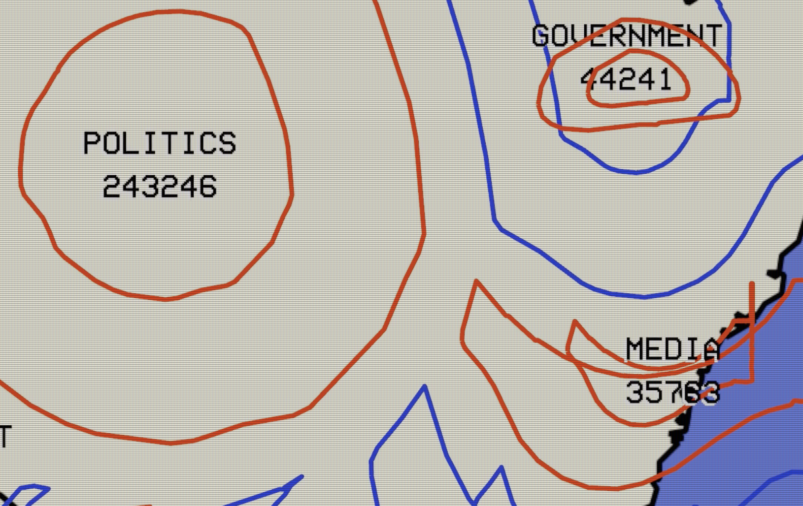
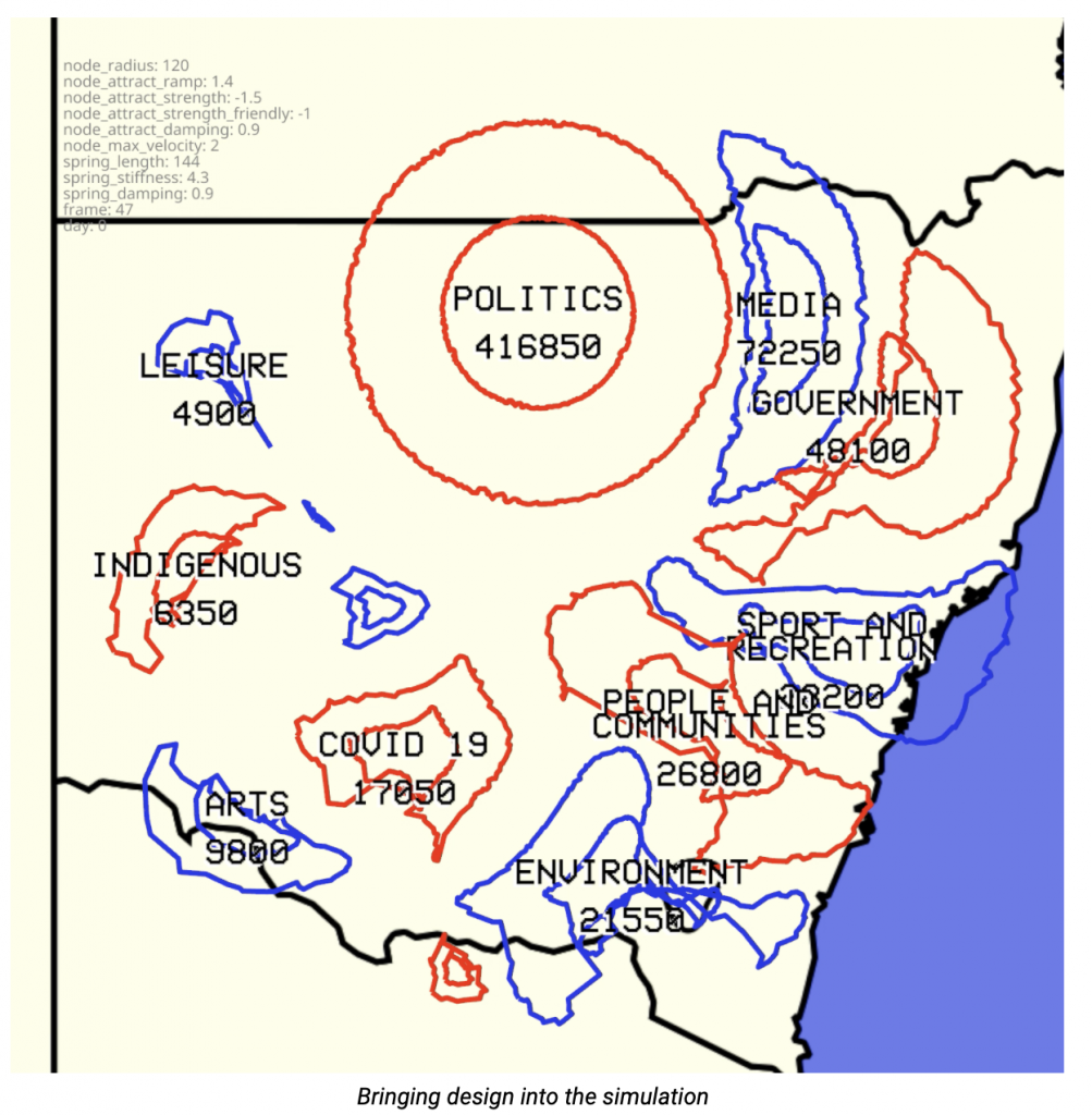
Which Way the Wind Blows represents a novel way to visualise patterns in social media posts using the Library’s social media archive.
Leveraging people’s familiarity with nightly weather reports, changing topics of interest are visualised as evolving pressure systems, isobars and troughs. These social posts present a different kind of record of life in NSW — a self-documenting account of what people think and care about.
Since 2012, the Library has archived tens of millions of publicly available social media posts using the CSIRO’s Vizie tool. This partnership with CSIRO’s Data 61 Lab has become a new pillar in the Library’s Digital Collecting Strategy. While the collection is a rich and versatile resource for researchers, its existence and purpose are less apparent to the people outside of the research community. Which Way the Wind Blows aims to improve public awareness and appreciation of the Social Media Archive via casual visualisation — data visualisation that avoids complex analytic dashboards in favour of speaking to the imagination in simple and creative metaphors.
In the design, each topic becomes a pressure system which is represented as a group of contour lines, known as isobars. The size of a pressure system is determined by the number of social media posts within a topic — a popular topic will appear to be dominating the sky above NSW, pushing smaller topics out of its way. The shape and position of a topic are determined both by waxing and waning interest in that topic itself, and changes in activity for other topics on that day — being compressed and contorted by the larger topics around it. The end result is a time-based view of a dynamic social media discussion space.
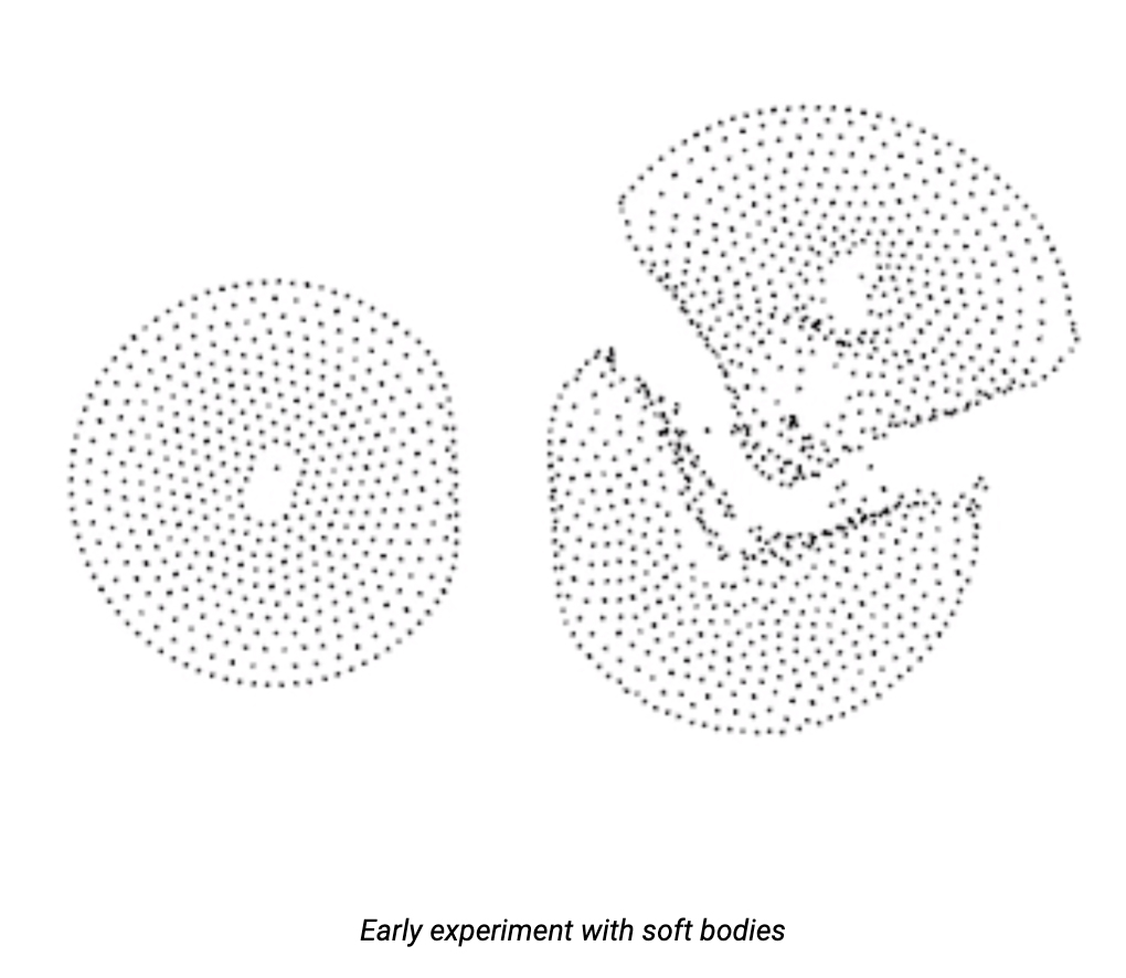
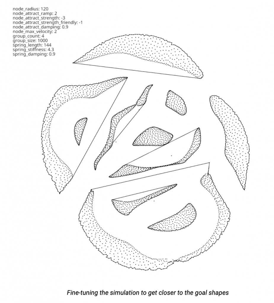
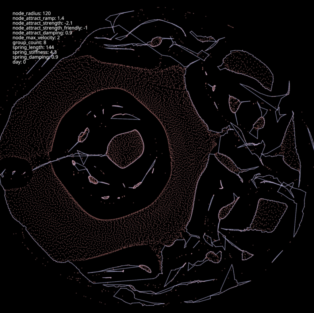
The visualisation was built with a combination of Node.js for data collection and processing, and a Rust application based on the nannou creative coding framework to create the visualisation. The visualisation has high performance and expressiveness requirements, and the (relatively) new Rust environment proved to have the perfect blend of speed and features for this use. The shapes themselves are formed by a particle simulation, based on soft body physics, whereby physical bodies interact and deform when colliding with each other. Particles are bound together with numerous ‘springs’, which both hold them together in clusters and allow for natural, physics-based interactions with other clusters. When forced into the square frame of the design, the shapes ebb and flow in familiar, smooth curves, each one unique and based on the prevailing ‘weather conditions’ at the time.

Which Way the Wind Blows lowers the barrier to entry on this archive by using familiar real-world metaphors to explain digital concepts. In this, the project draws on inspirations from precedents like Ocean of Books, Tweetures, and Waves of Interest. Not only are weather charts a familiar visual tool, but the metaphorical connection between weather, daily events and sentiment is deeply embedded in everyday language. The tide of history is turning, there are storm clouds on the horizon, and the endeavour is under a cloud — but after all, it’s an ill wind that blows nobody any good.
We hope that by ‘casualising’ the Social Media Archive data, we can promote awareness, encourage utilisation, and build an ecosystem for innovation around the archive — making the archive an integral part of the State Library collection.