The ORBIT experiment
In 2018 the Library was renovating and expanding the spaces it holds its free exhibitions in, and for the opening of the newly renovated spaces the DX Lab was asked to create some experiences. One was the 80Hz installation on the Library’s forecourt, another was the NewSelfWales exhibition – these have been extensively documented, but one that wasn’t was O.R.B.I.T.
Standing for ‘Our Readers Browsing In (real) Time’, ORBIT was a development of the idea of the DX Lab’s first Digital Fellowship ‘Unstacked‘, which reveals which objects from the catalogue are being viewed. For various technical reasons Unstacked uses a cached sample of historic browsing data, and so with ORBIT this was our chance to try out Google’s Real Time API and find out which catalogue items were being viewed by readers in real time.
ORBIT was located in the ‘circulation gallery’, a long space with a big flat wall at the end that has a projector pointing at it. We had a plinth with a touchscreen (and computer) in it which we could locate in the space also, allowing the public to interact with ORBIT.
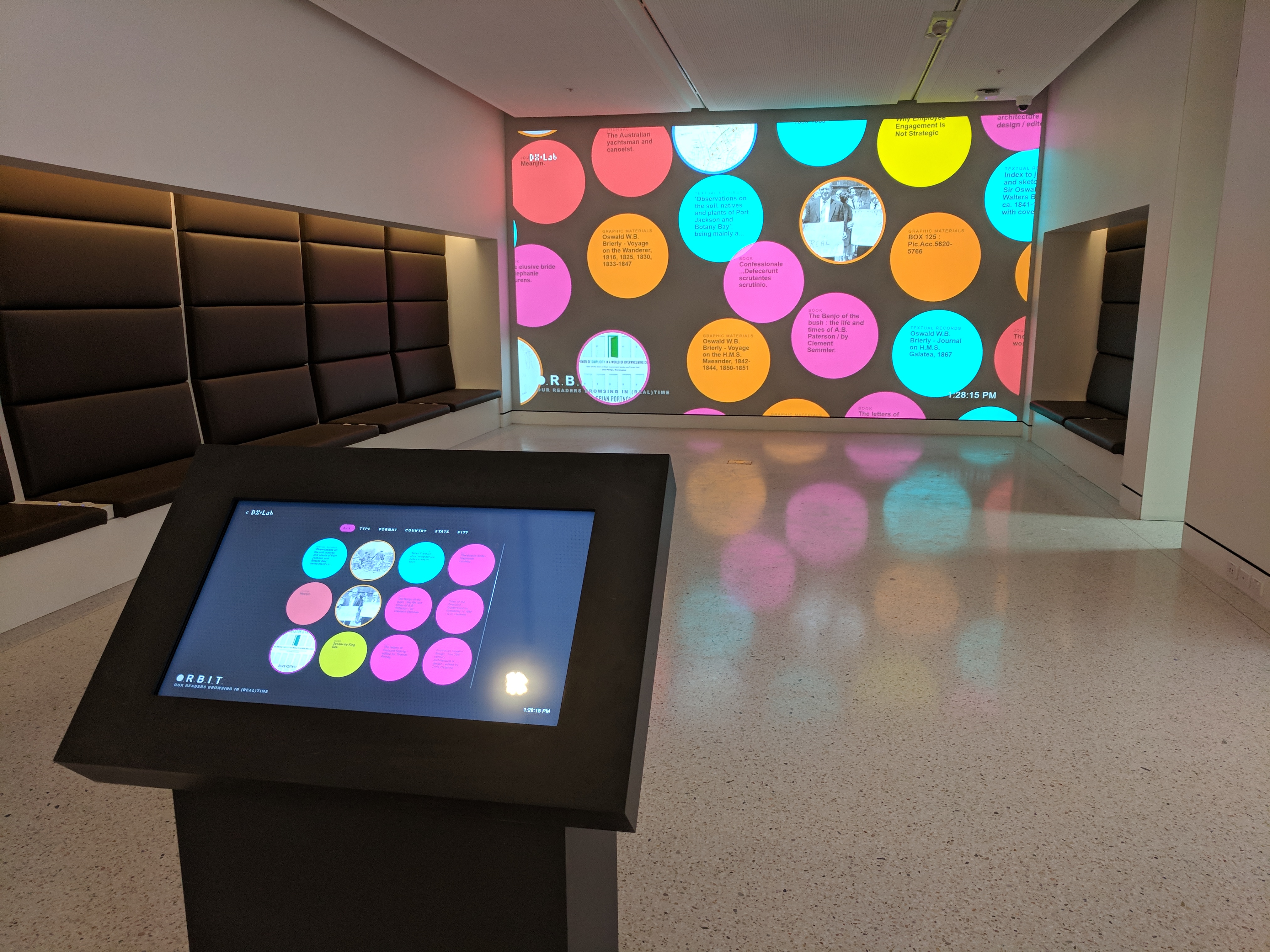
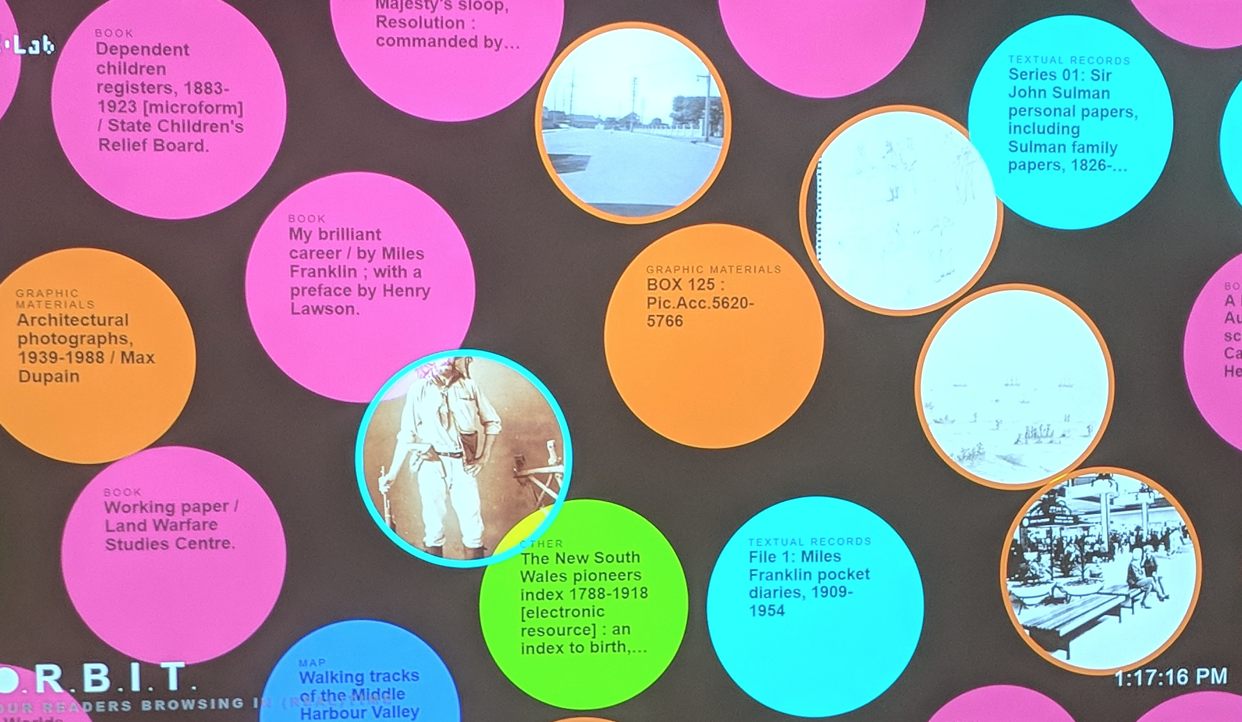
The objects from the catalogue that were being viewed by anyone, anywhere in the world appeared on screen in real time, each one encapsulated in a bubble. On the projector display these floated around, with the newer ones appearing in the middle, pushing the older ones outwards.
On the touch screen they were arranged in a grid and could be tapped on. This caused the projector display to focus on that item alone, showing the full set of information about the item. On the touch screen ‘next’ and ‘previous’ controls allowed the user to view other items.
The colour of each bubble was determined by the format of that object: book, map, image, journal, audiovisual, etc. A series of buttons on the touch screen allowed the user to group the items shown in different ways. One was by format. Another was by whether they were published on unpublished items. Then there was by information not relating to the objects themselves, but where the user viewing them was located, including country, state and city. This data was available from the Google Analytics Real Time API, rather than the Library’s catalogue.
And a bit more footage in this tweet.
Now a little technical run down of how it worked.
As the design of ORBIT meant the touch screen was the ‘control panel’ and the projector was the ‘display’, two video signals were needed. Initially we had hoped to run both video signals from the same computer located in the plinth. Unfortunately at that time there was no way of getting a video signal from any of the plinth locations up to the projector, so we ended up using two computers and locating one in the ceiling near the projector.
The plinth needed mains power and a network connection and those were available in specially constructed ‘wells’ in the floor of the space. There are only so many of these wells (which are covered with a brass plate when not in use) and one was way too close to the projection wall so we chose the next one. It was a bit too far away really but we didn’t have any other option.
The entire interactive was built using web technologies and upon booting each computer launched a full-screened, ‘kiosked’ Chrome web browser displaying a URL particular to its location. Unlike any of our previous experiments, the plinth PC ran two servers locally. One served the applications based on the Node/React framework next.js and the other was a GraphQL server.
Both the plinth PC and the projector PC’s web browsers requested their web content from the web server running locally on the plinth PC. The plinth PC polled the graphQl API regularly to discover the catalogue items currently being viewed by the public.
GraphQL was wrapped around the Library’s collection APIs as well as the Google Analytics Real Time API for the Library’s catalogue item views. It connected the data from both the Google API and the catalogue API to provide one unified payload for the Orbit feed.
The interaction was done by graphQL real time subscriptions. Anything tapped upon on the plinth PC meant it would send a signal to graphQL which in turn sent a signal to the projector PC to update its visualisation, essentially turning the plinth PC and its touch screen into a control panel for the other view on the projector.
We considered using our existing cloud based graphQL server however in the pursuit of responsiveness of the interface it was better to use a locally hosted version.
The code included an idle timer which monitored for lack of use of the touchscreen and reset the view to the initial state. It had a secondary function which was to periodically display a video of another DX Lab experiment Field of View on the projector, however if a user came along and began interacting with the touch screen it reverted to displaying ORBIT once again.
One side effect of using locally installed servers meant that no web version ORBIT was ever made. It was only on display in the circulation gallery for a short few weeks. This blog post is all that remains to document it.